Higher Spending Leads to Poorer Education? A Bayesian Statistics Project using Monte Carlo Techniques
If a state spends more on education, does its students perform better?

This has been a fierce point of debate between many politicians and researchers in the States. The discussion is fueled by the tug of war between the Trump’s administration who proposes to slashed Federal Education Budget and the Congress who adamantly rejects such a proposal year after year.

Our gut feeling may instinctively nod at the idea that more education spending results in better education outcomes. After all, a larger funding in education allows schools to provide quality learning resources, which help students learn better and thus perform better in standardized tests. This train of thought appears to be supported by research as well: the National Bureau of Economic Research found that states which provide higher education funding to the poorest school districts see more academic improvement in education outcomes than those which did not in the long run.

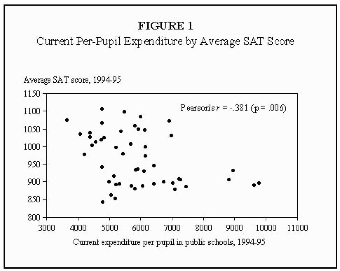
However, others have pointed out the contrary — rightfully so —using data. Guber (1999) found that on a state level, a higher per capita public school spending is correlated with poorer performance in SAT between 1994 and 1995(Figure 1).
In this post, I will attempt to debunk that the hypothesis that an increase in public funding in education does not correlate with higher students’ performance in standardized tests, while controlling for other factors using a Bayesian statistics implemented in R using the rJAGS package. This is done in 5 steps.
- Choosing the data
- Visualizing the data
- Modeling the data
- Analyzing the model
1. Choosing the Data
The data set used is the data set from Guber (1999) in his paper ‘Getting What You Pay For: The Debate over Equity in Public School Expenditures’. The data is chosen because it contains data that describes the per-pupil expenditure on education and the education outcomes (SAT scores) in various states from 1994–95. By modeling this data, we can find out the relationship between expenditure and education outcomes.
To retrieve the SAT data from using R’s faraway library, the following code is implemented in R.
library(faraway)
data(sat) #retrieves the Guber (1999) data set
The table below shows a description of the data set.
2. Visualizing the Data
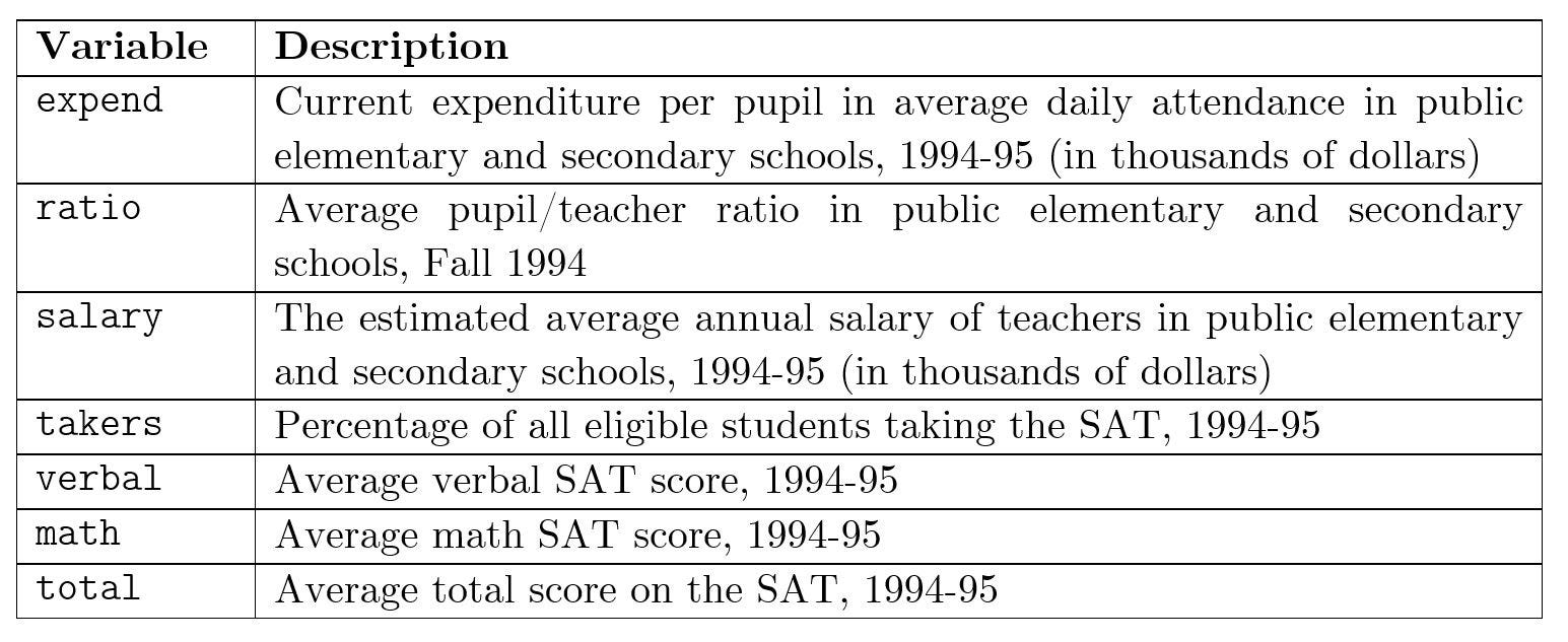
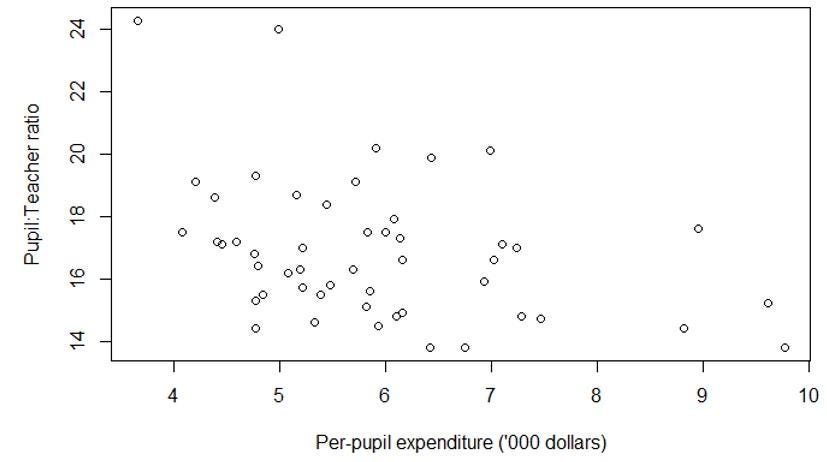
Before we jump into analyzing the data, we would like to understand the relationship between the features in the data set. To do so, we create scatter plots between the variables listed in Table 1. From there, we can distill a few observations.
Observation 1: Unsurprisingly, as per-pupil expenditure increases, the teacher-to-pupil ratio increases (Figure 3) and teachers become better compensated (Figure 4).
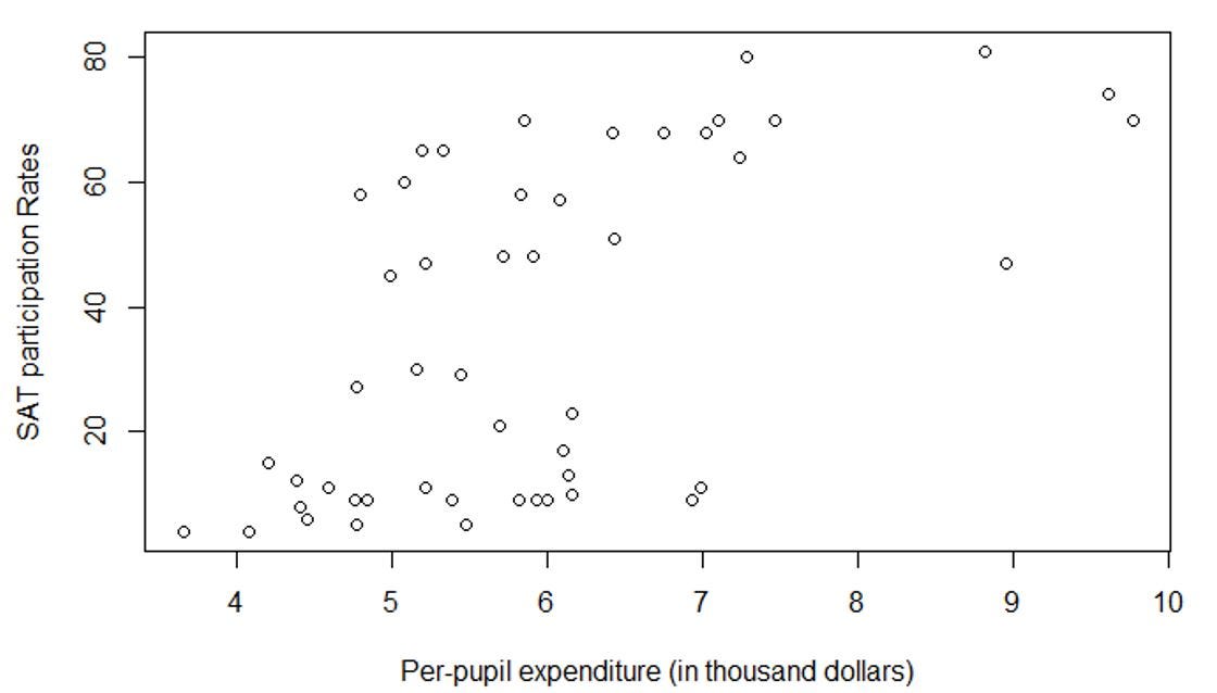
Observation 2: As per-pupil expenditure increases, the SAT participation rate increases (Figure 5). In other words, the expenditure increases the accessibility of SAT to a wider populace of students.
The additional expenditure could have given opportunities to students in the poorer school districts educational resources that were previously inaccessible to them. The said resources help prepare them sit for the SAT test.
3. Modeling the Data
3.1 The General Approach to Modelling
To model this data set, we first assume a probability distribution of the data. We then use a Bayesian statistical method to infer the parameters of the probability distributions, which can then be used as evidence for or against the hypothesis that increased funding leads to improved education outcomes.
The Bayesian statistical method can be implemented using Markov Chain Monte Carlo sampling, which is an algorithm to approximate the data observed to a distribution. The MCMC sampling can be implemented using the rJAGS package using R.
3.2 Modelling of the Actual Data
In this example, I will conduct the familiar linear regression of SAT scores with an intercept and five features: expenditure (‘expend’), student-teacher ratio (‘ratio’), salary (‘salary’), and the SAT participation rate (‘takers’).
This is equivalent to saying that the total SAT scores is modeled as a normal distribution with mean μ and a variance σ². μ can, in turn, be described by a linear combination of an intercept, expend, ratio, salary and takers. The coefficients of each of the features are β.
Mathematically, this can be expressed as
In this project, our objective is to find the mean values of β and find evidence that debunks the hypothesis that ‘higher expenditure does not lead to better outcomes’. In this analysis, the coefficient β₂ is important because it describes the (linear) relationship between expenditure (‘expend’) and the SAT scores (‘μ’). This will be elaborated in the analysis portion later.
The corresponding code block for rJAGS is as follows (note: the name of the variable is described in Table 1)
for (i in 1:length(total)) {
total[i] ~ dnorm(mu[i], prec) #SAT Score is modelled.
mu[i] = beta[1] + beta[2] * expend[i] + beta[3] * ratio[i] + beta[4] * salary[i] + beta[5] * taker[i]
}
Since we do not have much prior information on the effect of each feature on the SAT scores, we assume that the coefficients β have priors that do not contain much information, also known as non-informative priors. In particular, the β coefficients are assumed to follow a normal distribution with mean 0 and variance 10⁻⁶, which essentially produces an almost-flat distribution. This can be expressed as in mathematical formula and in code as

for (i in 1:5) {beta[i] ~ dnorm(0, 1e-6)}On the other hand, the σ² coefficients are assumed to follow an inverse-gamma distribution with an effective sample size of 1 with an initial guess of 20.

tau ~ dgamma(1/2,1*20/2.0)  #precision is a gamma distribution.
sig2 = 1 / tau              #variance is an inverse gamma distribution.
From this model, we would be able to achieve two objectives.
- produce the posterior probability that the coefficient between the mean SAT Score μ and Expenditure is positive. Mathematically, this translates to P(β₂>0).
- Moreover, we can also simulate the posterior predictive distributions of SAT scores using the model created in two hypothetical US states, one with high and another with low expenditure. This allows us to see the impact of education after adjusting for other factors.
The Implementation in R using rJAGS
The code below summarizes what has been mentioned above. In rJAGS, the model has to be described in a string (mod_string).
library('rjags')
mod_string =' model {
  for (i in 1:length(total)) {
    total[i] ~ dnorm(mu[i], prec) #SAT Score is modelled.
    mu[i] = beta[1] + beta[2] * expend[i] + beta[3] * ratio[i] + beta[4] * salary[i] + beta[5] * taker[i]
  }
  for (i in 1:5) {
     beta[i] ~ dnorm(0, 1e-6)
  }
  tau ~ dgamma(1/2,1*20/2.0)  #precision
  sig2 = 1 / tau              #variance
  }'
Now that the model has been described fully, we would like to run the MCMC chains.
We then run the Markov Chains using the code below. This can be broken down into a few simpler steps.
data_jags = list(total = sat$total, expend = sat$expend, ratio = sat$ratio, salary = sat$salary, takers = sat$takers)
mod = jags.model(textConnection(mod_string), data=data_jags, n.chains=3)
2. Creating ‘burn-in’ of 1,000 samples. This means that the first 1,000 samples drawn from the simulated distribution are disposed of.
We run 3 chains.
params = c('beta','sig2')
data_jags = list(total = sat$total, expend = sat$expend, ratio = sat$ratio, salary = sat$salary, takers = sat$takers)
mod = jags.model(textConnection(mod_string), data=data_jags, n.chains=3)
update(mod, 1000) #burn in of 1,000 samples
3. Run the simulation. Here, we run 10,000 iterations
mod_sim = coda.samples(model = mod, variable.names = params, n.iter= 1e5)
mod_csim = do.call(rbind, mod_sim)
4. Check whether a stationary distribution has been reached using a trace plot. The trace plot tells us the history of a parameter value across iterations of the chain. The command for creating the trace plot is
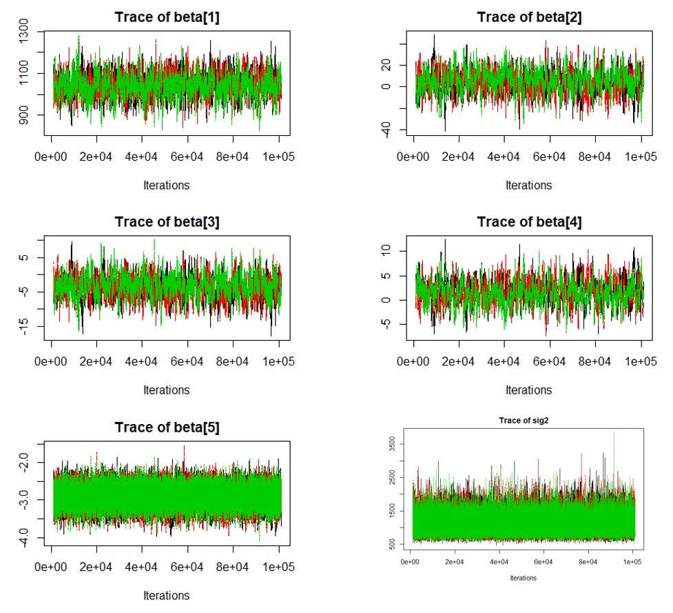
traceplot(mod_sim)If the there is no obvious upward or downward trend in the trace plots of the parameters (Figure 6), the chain has converged and then a stationary distribution has been reached. In this context, this means that the parameters β₁ β₂ β₃ β₄, β₅ and μ for the approximate distributions has converged. This tells us that even if we run the simulation longer, the values of the parameters are not likely to change significantly. This is shown in Figure 6, where the trace plot of the 6 parameters are fluctuating around a horizontal line.
- Side note: An alternative method for checking the convergence of MCMC chain is the Gerlman diagnostics. It calculates the potential scale reduction factor, which can be interpreted as the ratio of a within-chain and between-chain variances.Deviation of the reduction factor from 1 indicates non-convergence. It can be calculated using
autocorr.diag(mod_sim)5. The modelling is complete. We are now ready to view the results of the simulation and a summary of the distribution. This is done by the code
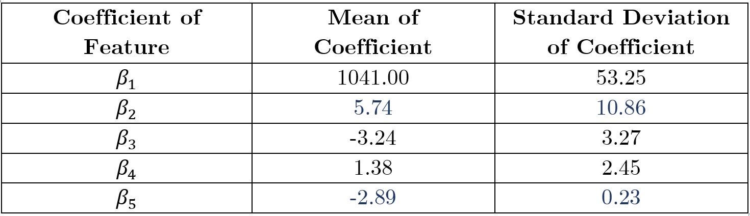
summary(mod_csim)With this summary (Table 2), we can then extract relevant information and perform analysis.
4. Analyzing the Model
Let us remind ourselves of the model proposed earlier in step 2 (modeling the data).
4.1 Analysis of β₂
β₂ is important in analyzing the (linear) relationship between SAT score and the expenditure, as mentioned in step 2. Here, we see that the mean value of the coefficient β₂ is positive (5.74). Physically, this means that all else remains constant, for every $1 increase in expenditure spent per student, there is an increase in the mean of the SAT score by 5.737.
However, we see that the standard deviation of β₂ is large (10.86) relative to the mean (5.74). This indicates that the model is not extremely certain of the effect of expenditure on SAT score. We can confirm this as the posterior predictive probability of β₂ being positive is 66.94%, i.e. P(β₂>0) =66.94%. This is obtained using the command
mean(mod_csim[,c(2)]>0
This command calculates the average number of simulated samples of β₂ that is above 0. This tells us, on average, 66.94% of the simulated samples of β₂ are positive. That is not an overwhelmingly large number, indicating the uncertainty over the value of β₂.
Thus, the conclusion is that we cannot reject the hypothesis that ‘increased funding does not lead to improved education outcomes’ with high confidence.
4.2 Analysis of other coefficients
β₅ is the coefficient for the SAT participation rate. Thus, the coefficient β₅=-2.89 (Table 2) tells us that as the SAT participation rate increases by 1%, the average total SAT score decreases by -2.89 on the state.
We then observe that coefficient β₅ has a relatively small standard deviation (0.23) relative to its mean (-2.89) (Table 2). This indicates that the model is relatively certain on the value of β₅, which tells us that we are certain about the effect of SAT participation rate on the SAT scores.
Indeed, the 99.99% highest posterior density of the value of β₅ is all negative in the range of [-4.12, -1.88]. Physically, this means that we are 99.99% certain that β₅ is in the range [-4.12,-1.88]. Thus, it is almost 100% certain that β₅ is negative — which tells us that as the percentage of eligible students increase, the average SAT scores decreases. This is obtained using the command
HPDinterval(mod_sim, 1)
4.3. Analysis of increased fundings ≠ improved SAT scores
We can explain why increased fundings and improved SAT scores are not highly correlated by reminding ourselves of our past observations.
- From Section 2, we see that as per-pupil expenditure increases, the SAT participation rate increases (Figure 5).
- From Section 4.2, we are certain that increasing SAT participation rate decreases the average SAT scores.
Thus, we connect the dots to say that increasing funding is correlated with increasing participation rate, which decreases the average SAT scores. Why is this so?
We reason this by postulating that only the most prepared students take the SAT when a small percentage of eligible students take the SAT. These students are more likely to score higher on the tests. When a larger percentage of eligible students take the SATs, even those who are less prepared take the tests, and thus the average SAT scores are likely to drop.
5. Conclusion of the Model
From Section 4.1, we conclude that we cannot say with high confidence that increased funding correlates with improved SAT scores. More precisely, we cannot reject the hypothesis that ‘increased funding does not correlate to improved education outcomes’ with high confidence.
This project is created as a capstone project for the Courses that I have taken Bayesian Statistics: From Concept to Data Analysis and Bayesian Statistics: Techniques and Models. If you would like to learn more about Bayesian Statistics, MCMC Modeling and rJAGS, I would highly recommend these courses.
I will next be creating a blog post that explains the theory that underpins the MCMC Modeling technique.