How to be a Data Analyst - Data Viz with Google Data Studio
A Demo Report on Customer Churn by a Data Analyst

Are you an aspiring data analyst or data scientist looking to build up your portfolio and visualization skills?
Or are you a data analyst who wants to improve your visualization skills and business intelligence capabilities?
Or are you frustrated with the high cost of Tableau and is looking for a free alternative?
Today, I will show you my thinking process of creating data visualization using the (free!) Google Data Studio, and how you can create your own report for your portfolio — all without needing to code.
We will discuss…
- What is Google Data Studio
- Why you need to know data viz and reporting as an analyst
- How you can implement the process of analytics
- What you should include in an effective report
I will be using a demo report that I created on analyzing customer churn to run through this process.
About Google Data Studio
Google Data Studio lets you tell your story in data. In particular, it is a handy tool that allows you to —
- Visualize your data through highly configurable charts and tables.
- Easily connect to a variety of data sources.
- Share your insights with your team or with the world.
- Collaborate on reports with your team.
- Speed up your report creation process with built-in sample reports.
Not only that, it has the following awesome features.
- Strong visualization capability. Data Studio offers an impressive arsenal of visualization options including line charts, bar charts, pie charts, geomaps, area graph, bubble graphs, data tables, pivot tables and more.
- Great interactivity. Reports can be made interactive with viewer filter and date range controls. This allows the viewers to explore with the data.
- High customizability. One can include not only text, but also images, that change the look and feel of your report.
- Impressive connectivity. One can connect data from many different data sources into Google Data Studio, including Google Sheets (yes!) and CSV files. One can also connect real-time data to Google Data Studio, including Google Ads, Analytics, YouTube, BigQuery, MySQL, and even social media platforms like Facebook, Reddit and Twitter.
There are a wide variety of data visualization or business intelligence software that one can explore. These software include Tableau, Qlikview, FusionCharts, Highcharts, Datawrapper, Plotly and Sisense.
Each of these has its own merits but is generally expensive. If you would like to get your hands dirty using a free software, then Google Data Studio is right up your alley.
Note, however, that the software you use at work would be dependent on the tools available.
Note, google data studio offers awesome (free!) tutorials via its Analytics Academy.
Why Data Analysts Need to Know Data Viz
As an analyst in a tech firm, my responsibility is to perform different types of analytics and communicate insights. The four types of analytics include —
- Descriptive analytics reports what happened in the past.
- Diagnostic analytics uncovers the reason for past incidents by comparing descriptive data sets to identify patterns
- Predictive analytics aims to predict future outcomes by detecting tendencies in descriptive and diagnotic analyses.
- Prescriptive analytics attempts to identify what business action to take based on the three types above.
Arguably, all of these types of analytics involve some form of data visualization. Particularly, effective descriptive and diagnostic analytics are used by almost all stakeholders in a data-driven company and involve some heavy-lifting in data visualization.
These two forms of analytics can be performed easily on business intelligence or data visualization software, which allows analysts to create visualizations and stakeholders to access them.
As such, it is extremely helpful if a data analyst is well-versed in such software and can efficiently create visualizations that communicate insights.
The Process of (Diagnostic) Analytics

The report I will be sharing today is one of diagnostics analytics.
1. Understand the problem.
An understanding of the business problem is important because it allows a data analyst in providing an analysis that is in line with the business needs. Executing the request without an understanding of the problem is a futile exercise at best.
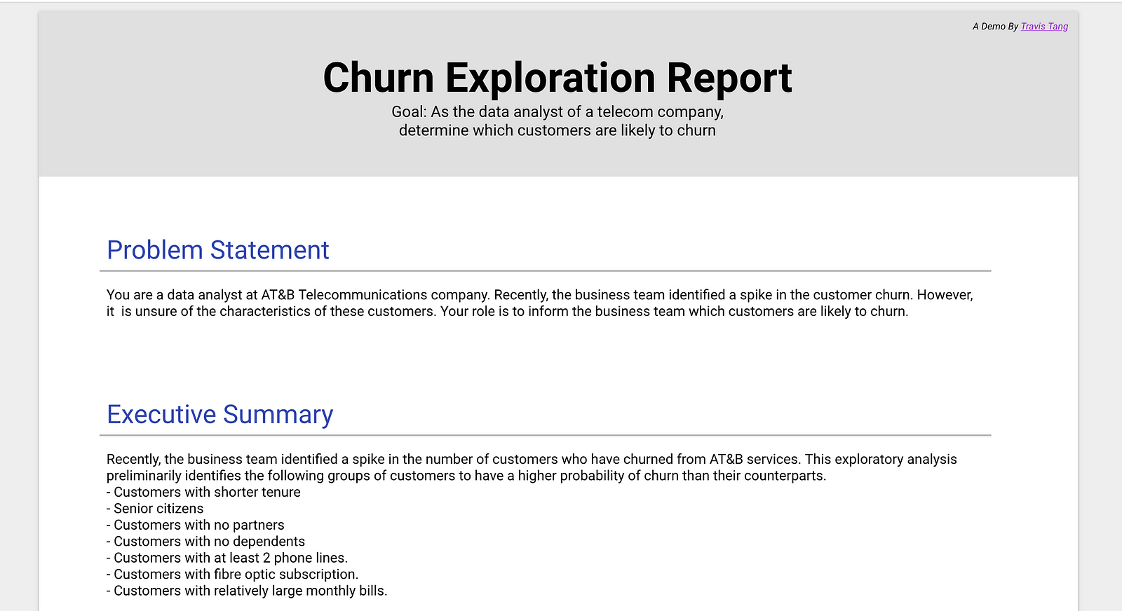
This report is created for the following mock scenario.
You are a data analyst at AT&B Telecommunications company. Recently, the business team identified a spike in the customer churn. However, it is unsure of the characteristics of these customers. Your role is to inform the business team which customers are likely to churn.
2. Plan the report.
Creating a mock-up of the report that you are about to create can speed up the analytics process tremendously. Having a plan will reduce distraction and help you to focus on the task on hand.
In this step, some questions you might want to ask yourself include:
- What are the important metrics to address the problem?
- What are the hypotheses that can address the problem?
Applying this to our case on hand, we know that the most important metric that we have to explore is ‘customer churn’.
Some of the hypotheses that can explain customer churn include:
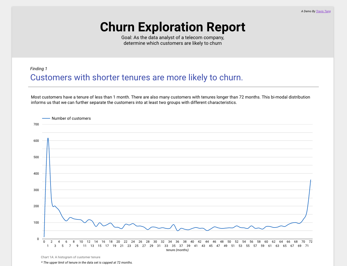
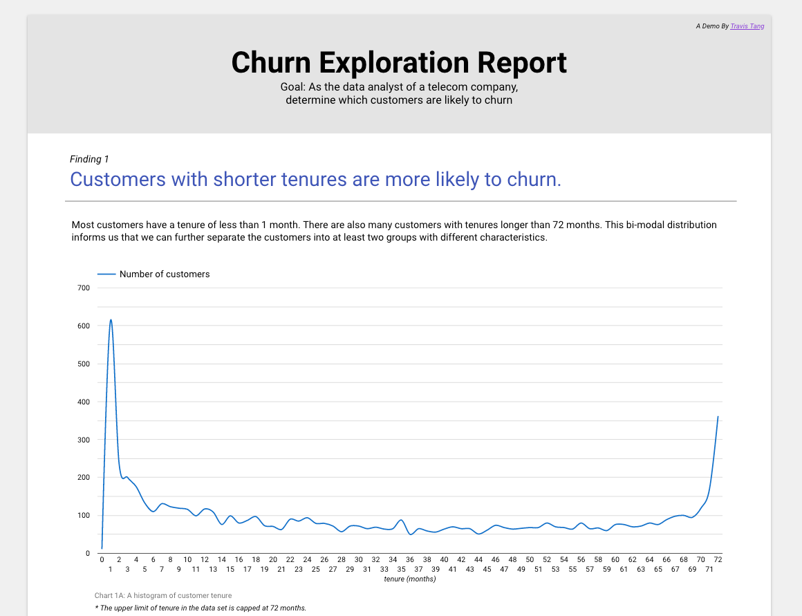
- Customers with shorter tenure have a higher churn
- Customers of certain demographics have a higher churn
- Customers who pay a higher price have a higher churn
- Customers who subscribe to particular services have a higher churn
3. Create a mock-up
After answering these questions, we can move on to create a mock-up of the report. This will help the analyst in visualizing the data required in step 4.
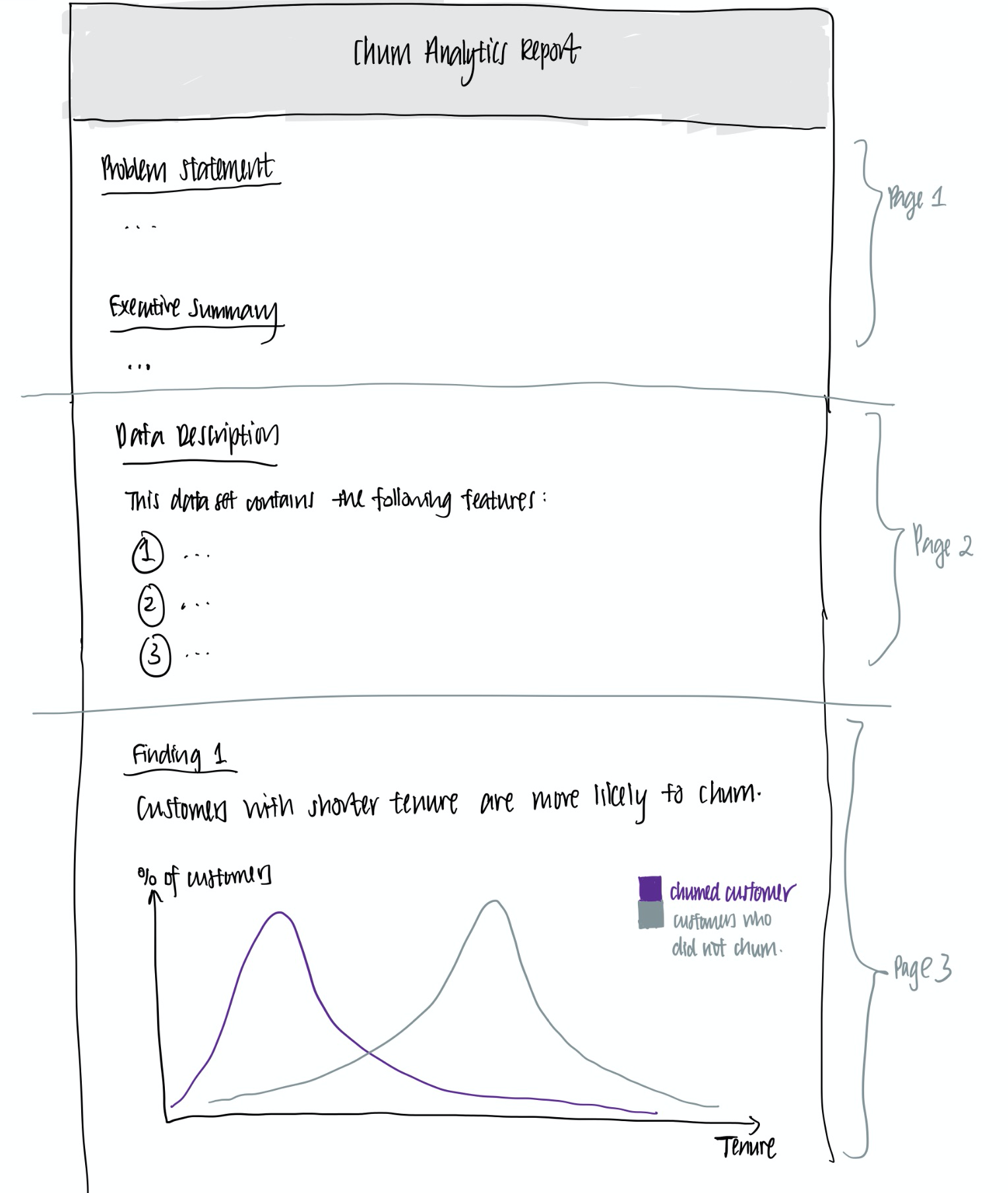
In this case, I have created the following mock-up. As you might notice, this is not the neatest nor the most aesthetically appealing — and that’s perfectly fine! It’s just a draft, after all.
4. Extracting and cleaning the data
Now that we have the hypotheses in mind, we can extract the relevant data that we would like to explore. In the typical case, one would use SQL to extract the relevant data.
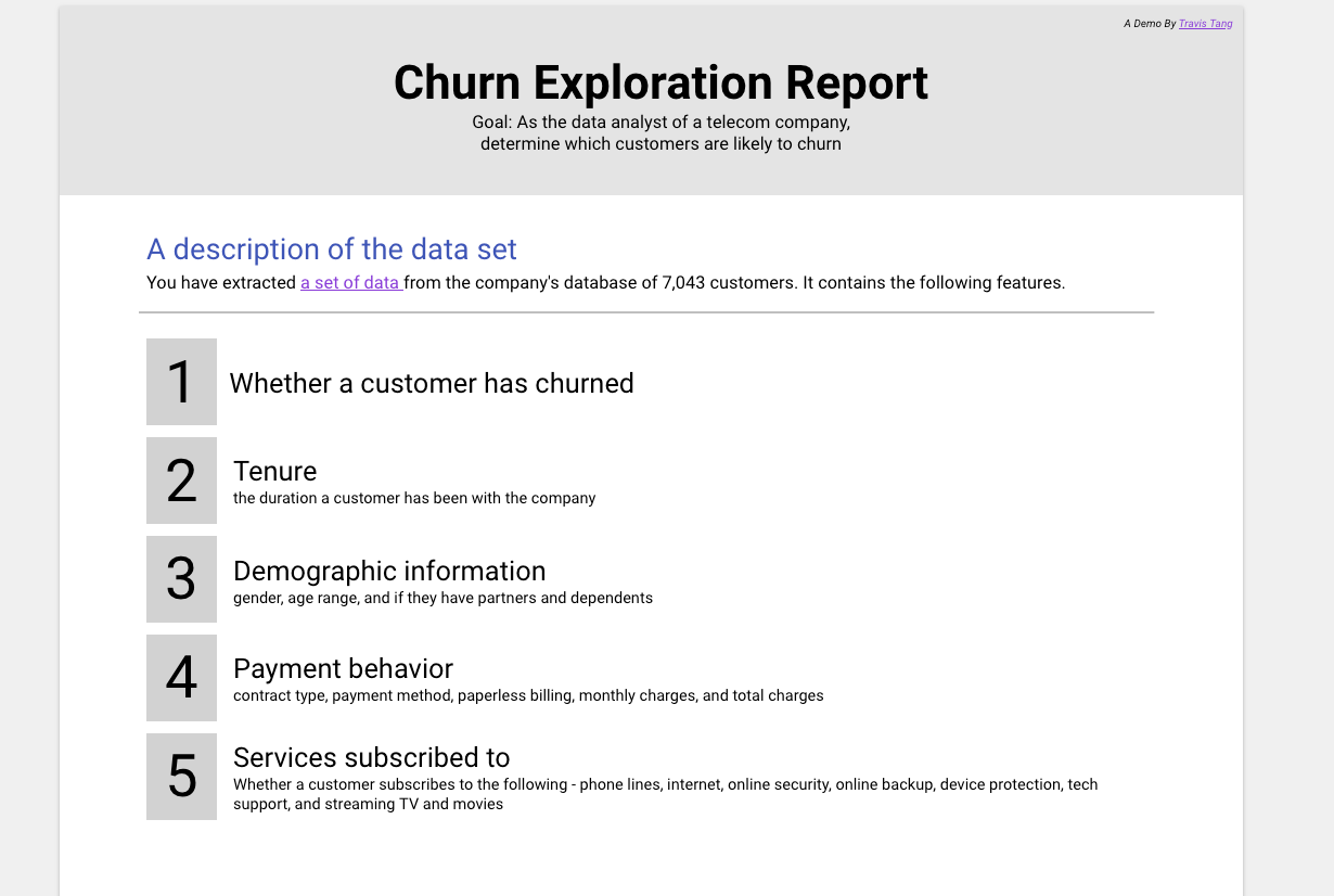
The data set used in this dashboard is available on Kaggle. It is a data set of a Telecommunications company of 7,043 customers. It contains the following features:
- Whether a customer has churn
- Customer tenure
- Customer demographic information (gender, age range, whether they have partners or dependents)
- Customer payment behavior (contract type, payment method, paperless billing, monthly charges, and total charges)
- Customer service subscription (whether the customer subscribes to a particular service)
In this case, the data set is clean. We can now move on to put our plan in action — using Google Data Studio!
The Anatomy of an Effective Report
Executive Summary
A report should include the problem statement that you are solving and the findings. This is outlined in Page 1 of the report.
Data Documentation
In order to help your stakeholders understand the report, proper documentation on the source of the data and the explanation of the data should be included. This is in Page 2 of the report.
The Findings
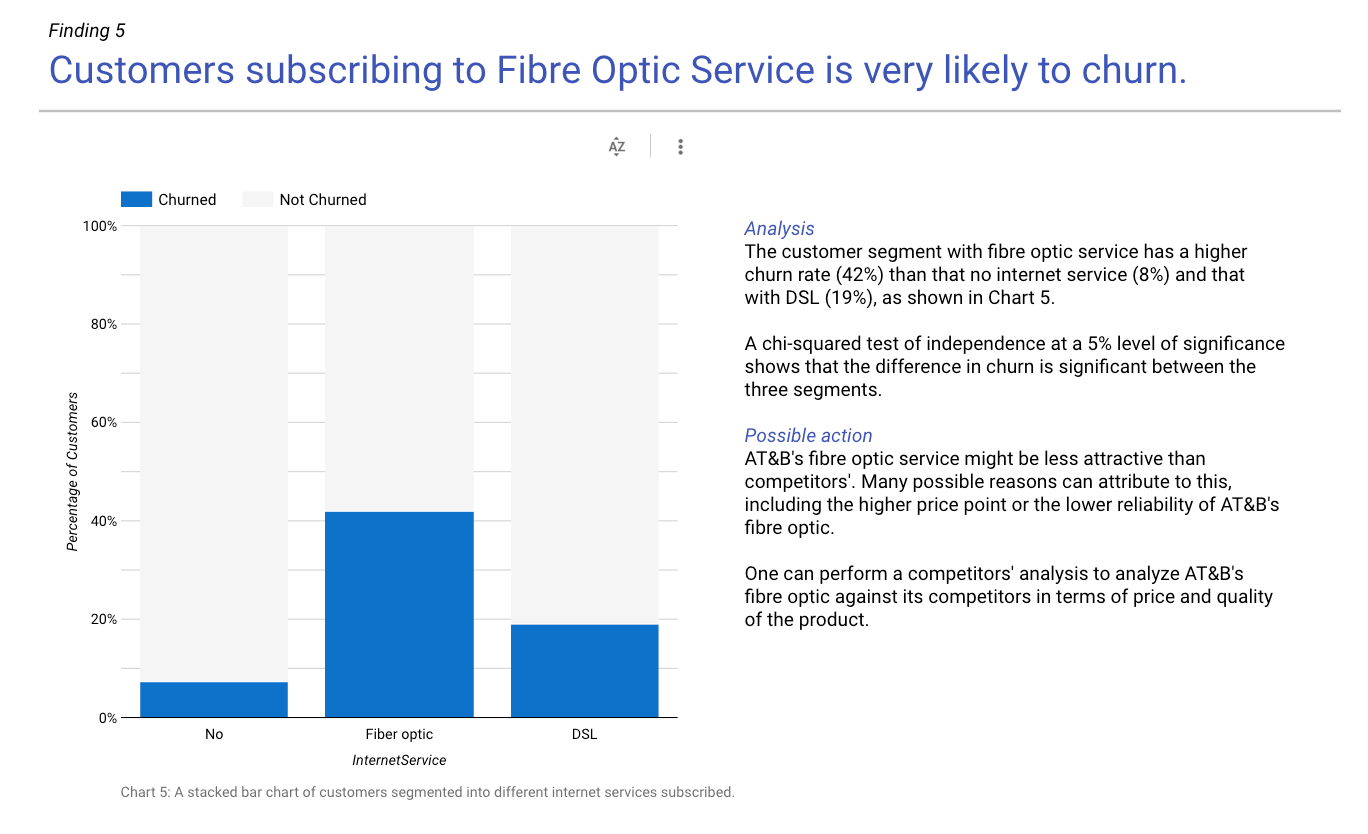
The findings are the most important part of the report. A finding section contains a heading, a visualization, an analysis and possible actions. This is in page 3 to 8 of the sample report, and can be seen as follows:
That’s quite a lot to unpack. Let’s break the findings section down into its anatomy.
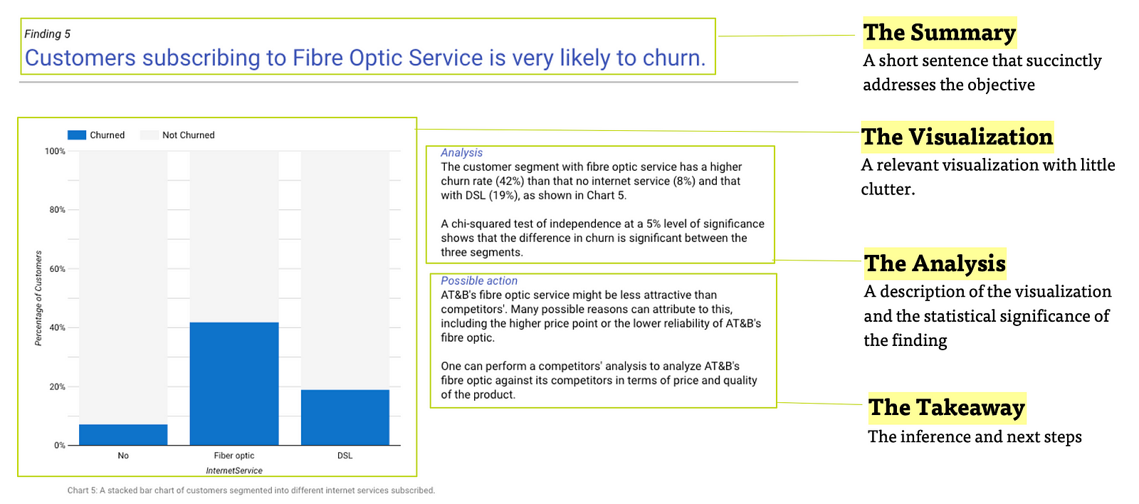
The Summary
Not all stakeholders have the time to digest all the visualizations created. Therefore, the header of each finding should be descriptive and summarize the finding from the graph.
The Visualization
An appropriate visualization should be made to support the finding. The visualization should also be clutter-free to not distract the reader from the message.
The Analysis
At times, it is helpful to describe the graph to guide the reader in interpreting the graph. Whenever possible and appropriate, the analyst should also establish the statistical significance of the finding to increase one’s confidence in the finding.
The Takeaway
The analyst can also attempt to make further hypothesis on the finding and possible further explorations. This portion can spark an interesting discussion with relevant stakeholders and initiatives to address the problem at hand.
Now it’s your turn!
I have deliberately left some analysis untouched so you can get a chance to practice. Do leave comments down below on what kind of analysis that you would include in this report.
If you would like to learn more,
Closing

Data visualization and reporting is an essential skill set of a data analyst and a data scientist.
It will be a bonus if you can build a report of your own and include it in your resume if you are looking for a role as an analyst or a data scientist.
Enjoyed this post? You might like this —


Feel free to connect with me on LinkedIn too. I will be happy to receive feedback, answer questions or just connect with like-minded individuals.