Interpreting Black-Box ML Models using LIME
Understand LIME Visually by Modelling Breast Cancer Data

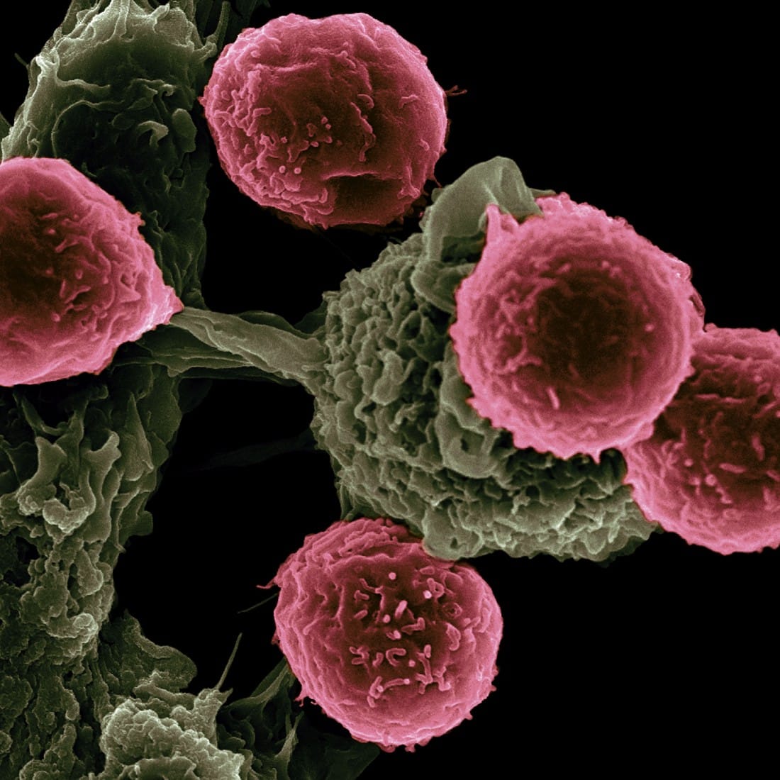
It is almost trite at this point for anyone to espouse the potential of machine learning in the medical field. There are a plethora of examples to support this claim — one would be Microsoft’s use of medical imaging data in helping clinicians and radiologists make an accurate cancer diagnosis. Simultaneously, the development of sophisticated AI algorithms has drastically improved the accuracy of such diagnoses. Undoubtedly, such amazing applications of medical data and one has all the good reasons to be excited about its benefits.
However, such cutting-edge algorithms are black boxes that might be difficult, if not impossible, to interpret. One example of a black-box model is the deep neural network, where a single decision is made after the input data passes through millions of neurons in the network. Such black-box models do not allow clinicians to verify the models’ diagnosis with their prior knowledge and experiences, making the model-based diagnosis less trustworthy.
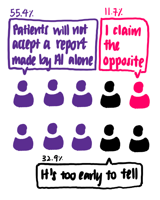
In fact, a recent survey of radiologists in Europe paints a realistic picture of the use of black-box models in radiology. The survey shows that only 55.4% of the clinicians think that patients will not accept purely AI-based application without the supervision of a physician. [1]
The next question is this: if AI cannot fully replace the role of physicians, then how can AI help physicians in providing an accurate diagnosis?
That prompted me to explore existing solutions that help explain machine learning models. In general, machine learning models can be divided into models that are explainable and models that are not. To put it loosely, models that are explainable provide outputs that correlate with the importance of each input feature. Examples of such models include linear regression, logistic regression, decision trees and decision rules, among others. On the other hand, neural networks form the bulk of models that are not explainable.
There are many solutions out there that can help with providing an explanation for black-box models. Such solutions include the Shapley values, the Partial Dependence Plot and the Local Interpretable Model Agnostic Explanations (LIME) which are popular among machine learning practitioners. Today, I will be focusing on LIME.
According to the LIME paper by Ribeiro et al [2], the goal of LIME is to ‘identify an interpretable model over the interpretable representation that is locally faithful to the classifier’. In other words, LIME is able to explain the classification result of one particular point. LIME also works for all kinds of models, making it model-agnostic.
Explaining LIME Intuitively: A Visual Walk-through
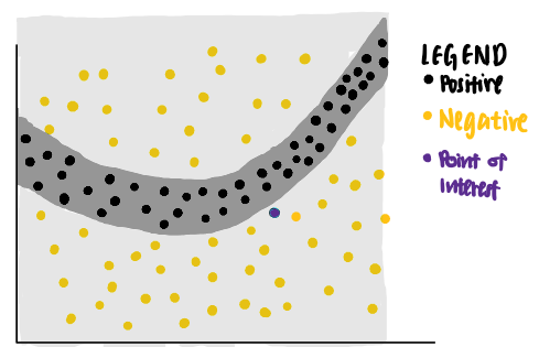
That sounds like a lot to understand. Let’s break it down step-by-step. Imagine we have the following toy data set with two features. Each data point is associated with a ground truth label (positive or negative).
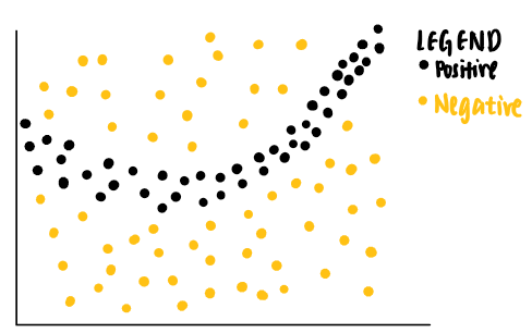
As can be seen from the data points, a linear classifier will not be able to identify the boundaries that separate the positive and negative labels. Thus, we can train a non-linear model, say a neural network, to classify these points. If the model is well-trained, it is able to predict that a new data point that falls in the dark grey area to be positive, while another new data point that falls in the light grey area to be negative.
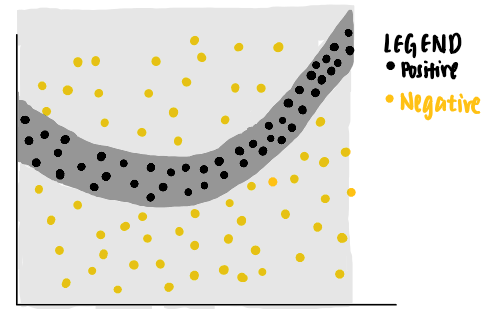
Now, we are curious about the decision made by the model on a particular data point (coloured purple). We ask ourselves, why is this particular point predicted to be negative by the neural network?
We can use LIME to answer that question. LIME first identifies random points from the original data set and assigns weights to each data point according to their distances to the purple point of interest. The nearer the sampled data point is to the point of interest, the more important it is to LIME. (In the picture, a larger dot indicates a heavier weight assigned to the data point.)
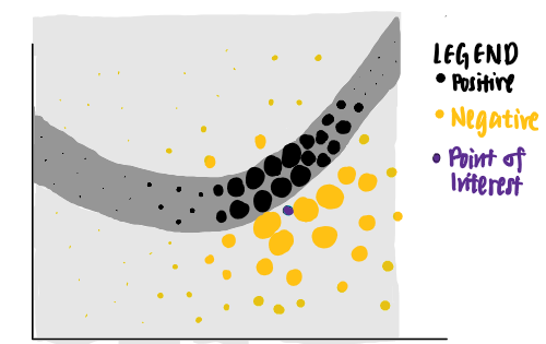
Using these points of different weights, LIME presents an explanation that has the highest interpretability and local fidelity.
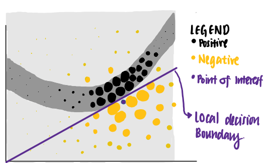
Using this set of criteria, LIME identifies the purple line as the learned explanation for the point of interest. We see that the purple line is able to explain the neural network’s decision boundary close to the data point of interest, but is unable to explain its decision boundary farther away. In other words, the learned explanation has high local fidelity but low global fidelity.
Let’s see LIME in action: now, I will focus on the use of LIME in explaining a machine learning model trained using the Wisconsin breast cancer data.
The Wisconsin Breast Cancer Data Set: Understanding the Predictors of Cancer Cells
The Wisconsin Breast Cancer Data Set [3], published by UCI in 1992, contains 699 data points. Each data point representing a cell sample which can either be malignant or benign. Each sample is also given a number 1 to 10 for the following characteristics.
- Clump Thickness
- Uniformity of Cell Size
- Uniformity of Cell Shape
- Single Epithelial Cell Size
- Mitoses
- Normal Nucleoli
- Bland Chromatin
- Bare Nuclei
- Marginal Adhesion
Let’s attempt to understand the meaning of these features. The following illustrations show the difference between benign and malignant cells, using features of the data set.
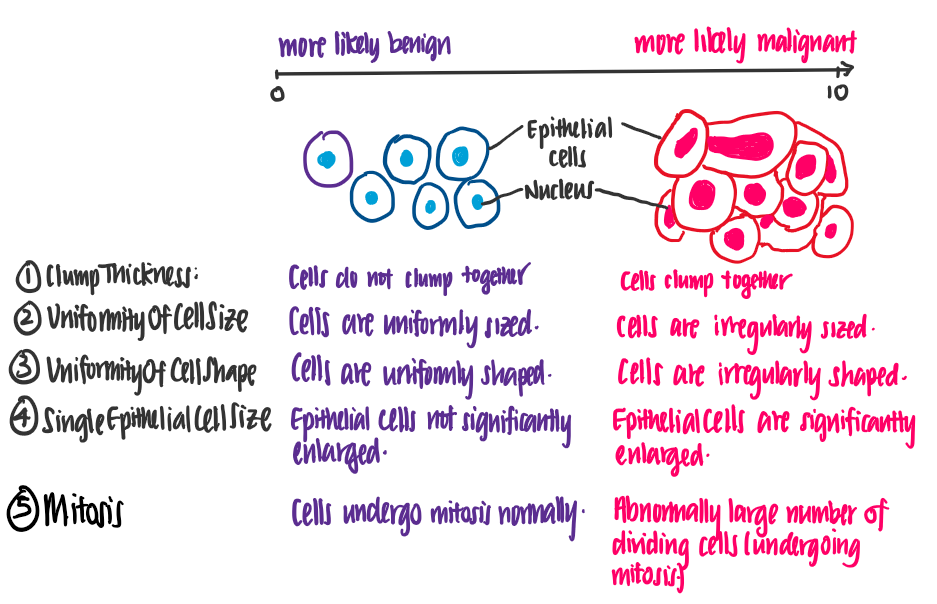
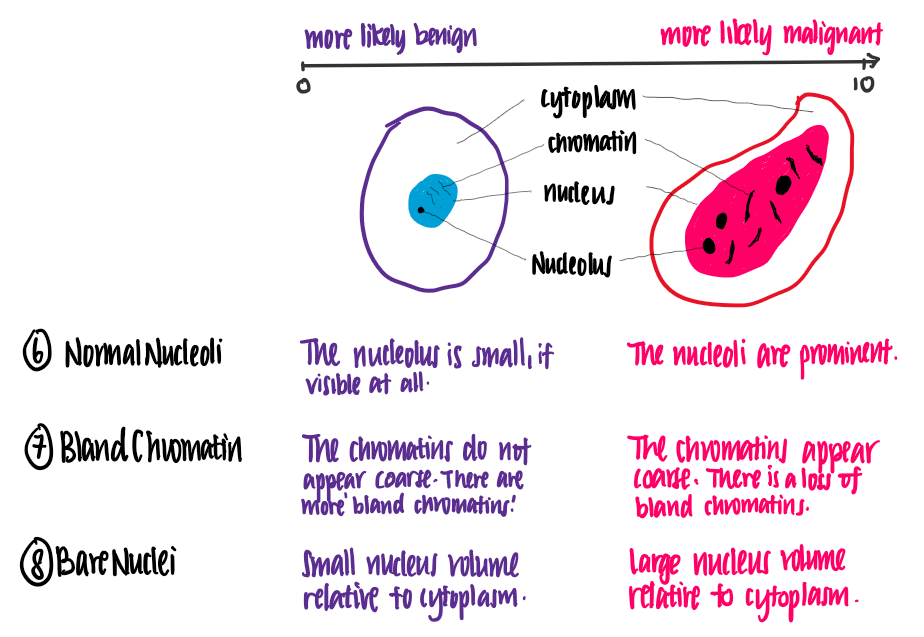
From this illustration, we see that the higher the value of each feature, the more likely it is for the cell to be malignant.
Predicting If a Cell is Malignant or Benign
Now that we understand what the data means, let’s get to coding! We first read the data, and clean the data by removing incomplete data points and reformatting the class column.
#Data Importing and Cleaning
import pandas as pd
df = pd.read_csv("/BreastCancerWisconsin.csv",
                 dtype = 'float', header = 0)
df = df.dropna() #All rows with missing values are removed.
# The original data set labels benign and malignant cell using a value of 2 and 4 in the Class column. This code block formats it such that a benign cell is of class 0 and a malignant cell is of class 1.
def reformat(value):
    if value == 2:
        return 0 #benign
    elif value == 4:
        return 1 #malignant
df['Class'] = df.apply(lambda row: reformat(row['Class']), axis = 'columns')
After removing the incomplete data, we briefly explore the data. By plotting the distribution of the class of the cell sample (malignant or benign), we find that we have more cell samples which are benign (class 0) than benign (class 1).
import seaborn as sns
sns.countplot(y='Class', data=df)
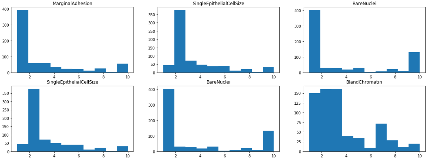
By visualizing the histograms of each of the features, we find that most features have a mode of 1 or 2, except ClumpThickness and BlandChromatin whose distributions are more evenly spread out from 1 to 10. This indicates that ClumpThickness and BlandChromatin might be weaker predictors of the class.
from matplotlib import pyplot as plt
fig, axes = plt.subplots(4,3, figsize=(20,15))
for i in range(0,4):
    for j in range(0,3):
        axes[i,j].hist(df.iloc[:,1+i+j])
        axes[i,j].set_title(df.iloc[:,1+i+j].name)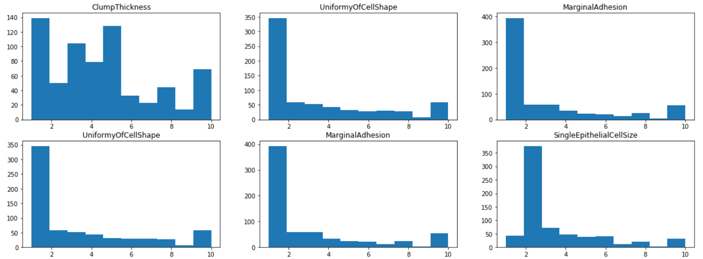
Model Training and Testing
Then, the data set is split into typical train-validation-test sets in a ratio of 80%-10%-10%, and a K-Nearest Neighbour model is built using Sklearn. After some hyperparameter tuning (not shown), a model with k=10 is found to perform well in the evaluation stage — it has an F1-score of 0.9655. The code block is shown below.
from sklearn.model_selection import train_test_split
from sklearn.model_selection import KFold

# Train-test split
X_traincv, X_test, y_traincv, y_test = train_test_split(data, target, test_size=0.1, random_state=42)

# K-Fold Validation
kf = KFold(n_splits=5, random_state=42, shuffle=True)
for train_index, test_index in kf.split(X_traincv):
    X_train, X_cv = X_traincv.iloc[train_index], X_traincv.iloc[test_index]
    y_train, y_cv = y_traincv.iloc[train_index], y_traincv.iloc[test_index]

from sklearn.neighbors import KNeighborsClassifier
from sklearn.metrics import f1_score,

# Train KNN Model
KNN = KNeighborsClassifier(k=10)
KNN.fit(X_train, y_train)
# Evaluate the KNN model
score =  f1_score(y_testset, y_pred, average="binary", pos_label = 4)
print ("{} => F1-Score is {}" .format(text, round(score,4)))
Model Explanation Using LIME
A Kaggle connoisseur might say that this result is great and that we can conclude the project here. However, one should be skeptical about the model’s decisions, even if the model performs well in evaluation. Thus, we use LIME to explain the decision made by the KNN model on this data set. This verifies the validity of the model by checking if the decisions made fit our intuition.
import lime
import lime.lime_tabular

# Preparation for LIME
predict_fn_rf = lambda x: KNN.predict_proba(x).astype(float)
# Create a LIME Explainer
X = X_test.values
explainer = lime.lime_tabular.LimeTabularExplainer(X,feature_names =X_test.columns, class_names = ['benign','malignant'], kernel_width = 5)

# Choose the data point to be explained
chosen_index = X_test.index[j]
chosen_instance = X_test.loc[chosen_index].values

# Use the LIME explainer to explain the data point
exp = explainer.explain_instance(chosen_instance, predict_fn_rf, num_features = 10)

exp.show_in_notebook(show_all=False)
Here, I have picked 3 points to illustrate how LIME can be used.
Explaining Why a Sample is Predicted to be Malignant

Here, we have a data point that is actually malignant and is predicted to be malignant. On the left panel, we see that the KNN model has predicted this point to have close to 100% probability to be malignant. In the middle, we observe that LIME is able to explain this prediction using each feature of the data point of interest, in order of importance. According to LIME,
- the fact that the sample has a value of >6.0 for BareNuclei makes it more likely to be malignant.
- since the sample has a high MarginalAdhesion, it is more likely to be malignant than benign.
- since the sample has a clump thickness > 4, it is more likely to be malignant.
- on the other hand, the fact that the sample has a value of ≤1.00 for Mitoses makes it more likely to be benign.
Overall, considering all the features of the sample (on the right panel), the sample is predicted to be malignant.
These four observations fit our intuition and our knowledge of cancer cells. Knowing this, we are more confident that the model is making predictions correctly as per our intuition. Let’s look at another sample.
Explaining Why a Sample is Predicted to be Benign
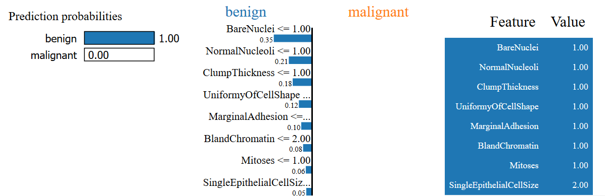
Here, we have a cell sample that is predicted to be benign and is actually benign. LIME explains why this is the case by citing (among other reasons)
- This sample has a BareNuclei value of ≤ 1
- This sample has a NormalNucleoli value of ≤ 1
- It also has a ClumpThickness of ≤1
- The UniformityOfCellShape is also ≤ 1
Again, these fit our intuition of why the cell is benign.
Explaining Why a Sample Prediction is Unclear
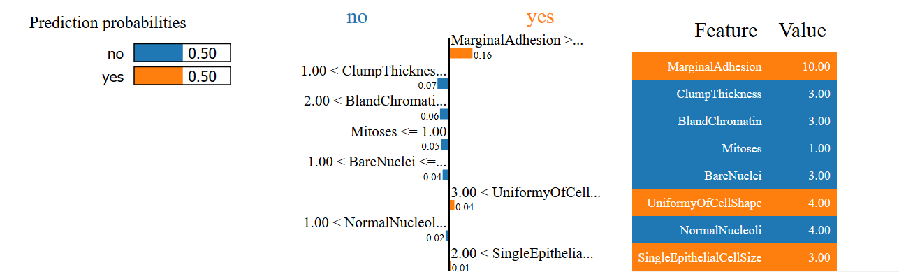
In the final example, we see that the model is unable to make a prediction of whether the cell is benign or malignant with high confidence. Can you see why this is the case using LIME’s explanation?
Conclusion
LIME’s usefulness extends beyond tabular data to text and images, making it incredibly versatile. However, there is still work to be done. For instance, the author of the paper contends that the current algorithm, when applied to images, is too slow to be useful. Nevertheless, LIME is still incredibly useful in bridging the gap between the usefulness and the intractability of black-box models. If you’d like to start using LIME, a great starting point would be LIME’s Github page.
If you are interested about Machine Learning Interpretability, be sure to check my article that focuses on using Partial Dependence Plot to explain a black-box model.
Feel free to reach out to me by LinkedIn for any feedback. Thank you for your time!
References
[1] Codari, M., Melazzini, L., Morozov, S.P. et al., Impact of artificial intelligence on radiology: a EuroAIM survey among members of the European Society of Radiology (2019), Insights into Imaging
[2] M. Ribeiro, S. Singh and C. Guestrin, ‘Why Should I Trust You?’ Explining the Predictions of Any Clasifier (2016), KDD
[3] Dr. William H. Wolberg, Wisconsin Breast Cancer Database (1991), University of Wisconsin Hospitals, Madison