What Makes Great Wine… Great?
Using Machine Learning and Partial Dependence Plot in the quest for a good wine

I don’t know about you, but I’m sure in the mood for some wine right now. But not just any wine — but good wine. Wine that tastes balanced, complex and long. It’s hard to say what each of those actually means, and these guys from Buzzfeed sure have a hard time describing good wine in words.
Sure, the concepts of the wine’s complexity and depth are elusive. But what if we can characterize what makes wine so enjoyable exactly — with numbers?
In this blog post, I will
- explain qualitatively what chemical properties of wine make it desirable using the UCI Wine Quality Data Set.
- explain how the Partial Dependence Plot can be used to explain which chemical properties of wine are desirable.
- build a machine learning model on the data set.
- Plot and explain the partial dependence plot in python.
So I did a little bit of research and saw the world of wine tasting from the eye of a chemist.
1. Understanding Good Wine Using Data
What chemical properties of wine make it desirable?
To understand what makes a wine good, I used the Wine Quality Data Set from UCI [1]. The data set is related to contains the chemical properties and the taste test results of 1599 wine samples. The wine in this study is the red and white variants of the Portugese Vinho Verde wine, though I will only use the data of the red variant in this post.
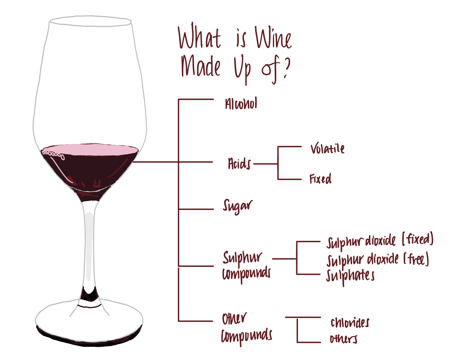
Wine is made up of the following components, among others.

- Alcohol. Wine generally contains between 5–15% of alcohols. This is the compound that makes us love wine.
- Acids: Acids give the distinct sourness that makes wine. Wines that lack fixed acidity is considered as flat or flabby, meaning they taste one-dimensional. There are two sources of acidity in a wine. One, the acids that naturally occur in the grapes used to ferment the wine and carry over into the wine (the fixed acid). Two, the acid that arises as a result of the fermentation process of yeast or bacteria (volatile acid).
- fixed acidity. These ‘fixed acids’ are acids that do not evaporate easily. They are tartaric, malic, citric or succinic acid, which mostly originate from the grapes used to ferment the wine.
- volatile acidity. ‘Volatile acids’ are acids that evaporate at low temperatures. These are mainly acetic acid, which can make wine taste like vinegar.
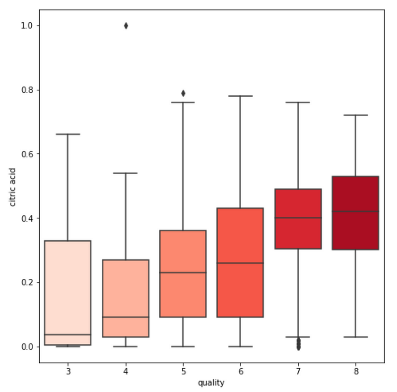
- citric acid. Citric acid is used as an acid supplement which boosts the acidity of the wine.
3. Residual Sugar. During fermentation, yeast consumes sugar to produce alcohol. The amount of sugar left after yeast ferments the wine is called residual sugar. Unsurprisingly, the higher the residual sugar, the sweeter the wine tastes. On the other end of the spectrum, a wine that does not taste sweet is considered as dry.
4. Sulfur compounds. Sulfur dioxide is a common compound used in wine-making. It prevents the wine from oxidation and infiltration by bad bacteria, making it an amazing preservative for wine. These sulfur compounds can be further divided into the following:
- free sulfur dioxide. When sulfur dioxide is added to wine, only 35–40% is yielded in the free form. When added in larger quantities and in smaller batches, a greater free SO2 concentration is achieved. All else constant, the higher the free sulfur dioxide content, the stronger the preservative effect.
- fixed sulfur dioxide. Free SO2 binds strongly to microorganisms in wine, creating fixed SO2. If a wine has high fixed SO2 content, it might mean that oxidation or microbial spoilage has happened.
5. chlorides. The amount of chloride salts present in the wine. This varies among wine produced from different geographic, geologic and climatic conditions. For instance, wines that are produced in vineyards near the sea have higher chlorides than those produced far away from the sea.
2. Predicting Good Wine Using Machine Learning
How the Partial Dependence Plot can be used to explain the predicted quality of wine
With such an understanding of what makes wine desirable, we can build a machine learning model to predict wine is of high quality and low quality based on their chemical properties. The result of the machine learning model can be explained using the partial dependence plot, which ‘isolates’ individual features among all features in the machine learning model, and tells us how the individual features affect the wine quality prediction.
More formally, a partial dependence plot visualizes the marginal effect of a feature on the predicted outcomes of the machine learning model [2].
This might seem a little daunting to understand. Let’s break it down visually.
A visual guide to Partial Dependence Plot
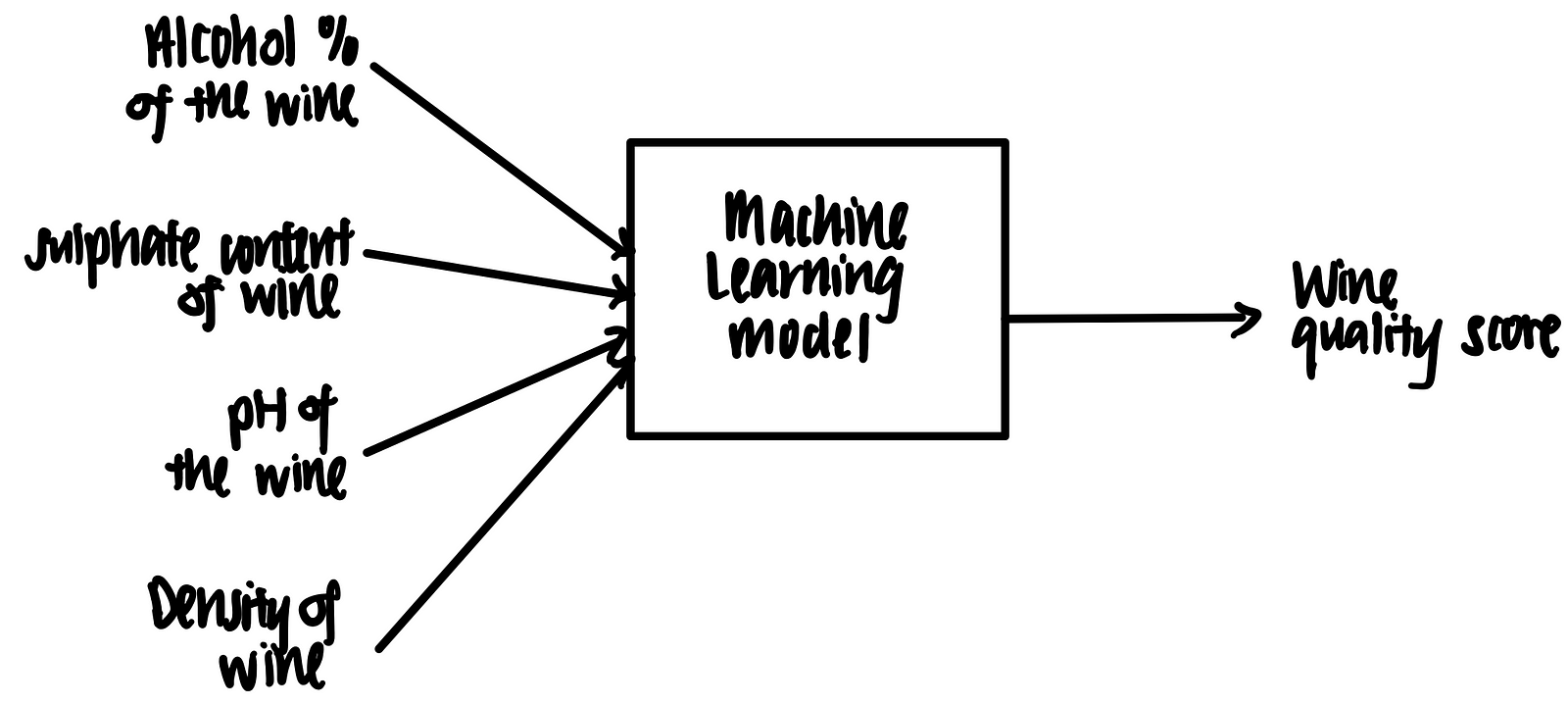
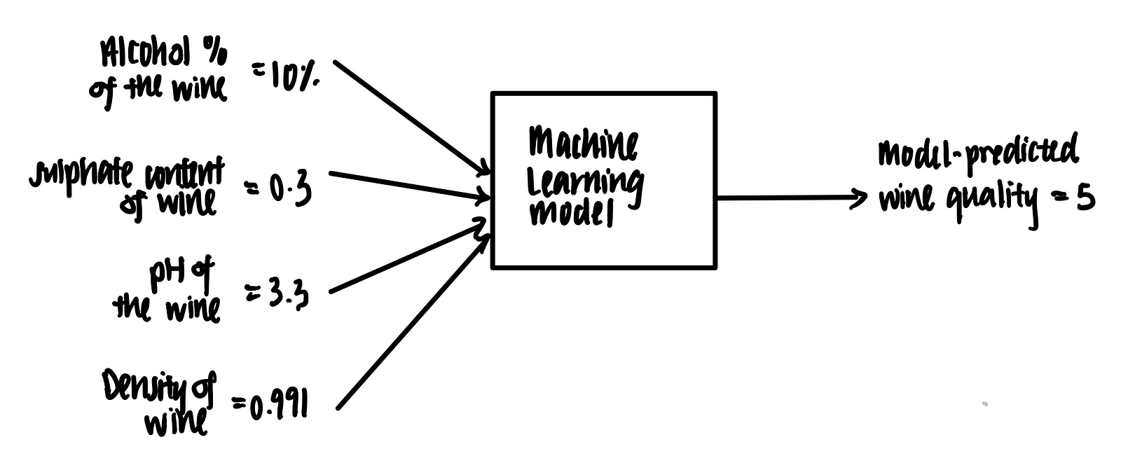
Imagine we have a trained machine learning model that takes in some features (alcohol %, sulphate content, pH and density) and outputs a prediction on the wine quality, as shown below.
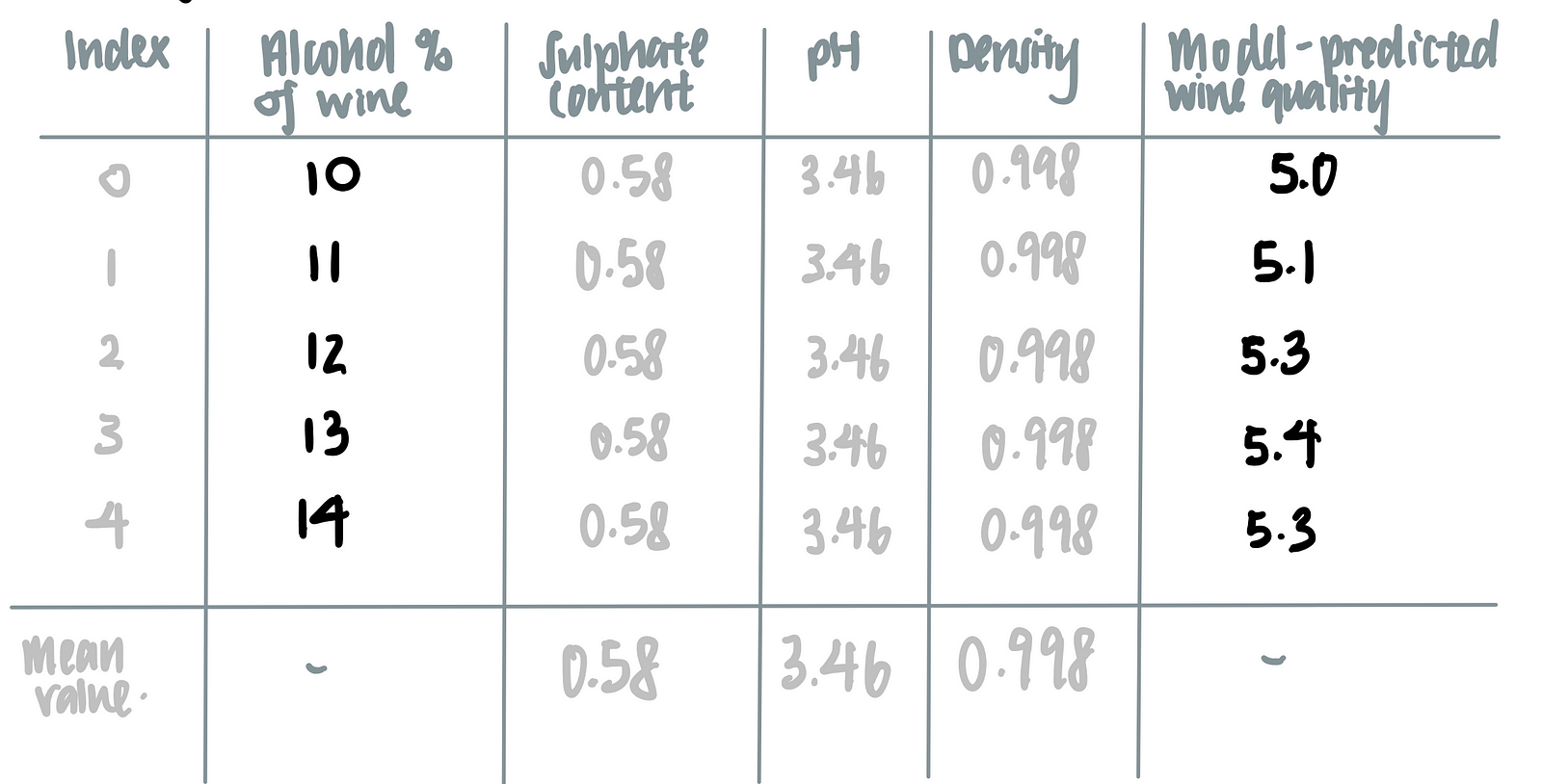
Let’s suppose we have the following data point in tabular format.
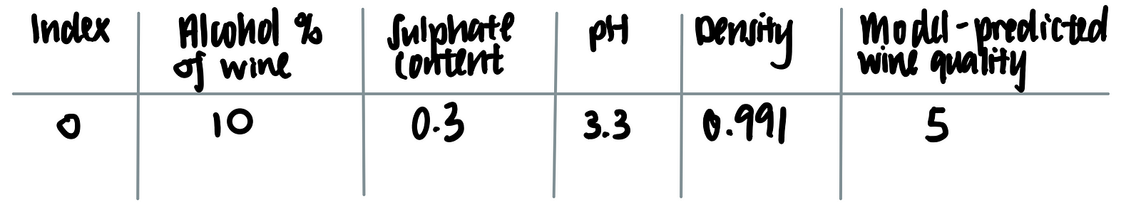
We feed this into the trained machine learning model. Voila, the model predicts that the wine quality score is 5 based on these features.
Now, we add the number of data points, such that we have not 1 but 5 data points.
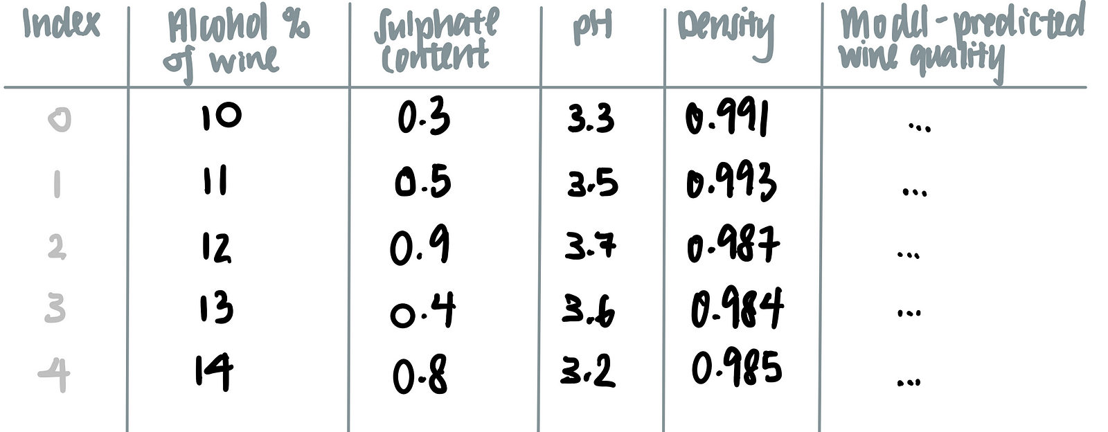
Let’s say we are interested in how the alcohol content affects the model’s prediction on the wine’s quality.To marginalize the model over the distribution over the feature ‘alcohol content’, we calculate the mean of all the other features (i.e. sulphate content, pH and density) as seen in the last row of the table below.
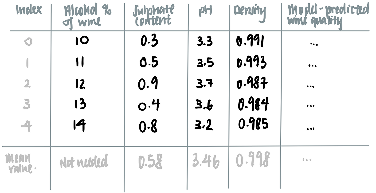
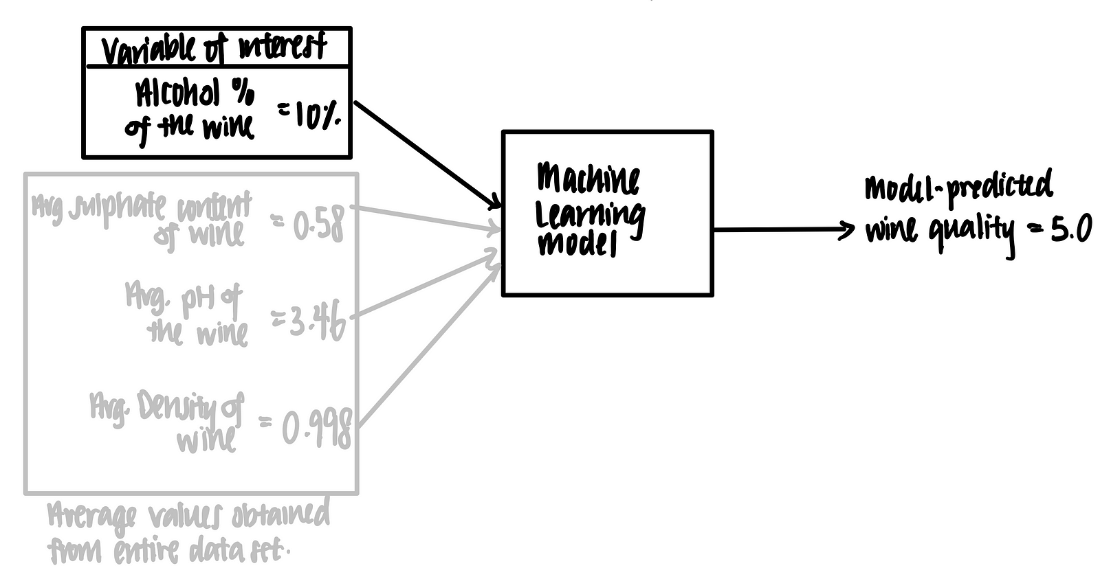
We then feed the alcohol content of each wine, together with the averaged values of sulphate content, pH and density, into the machine learning model, as such.
Using this logic, we make the following tabular representation of the partial dependence plot.
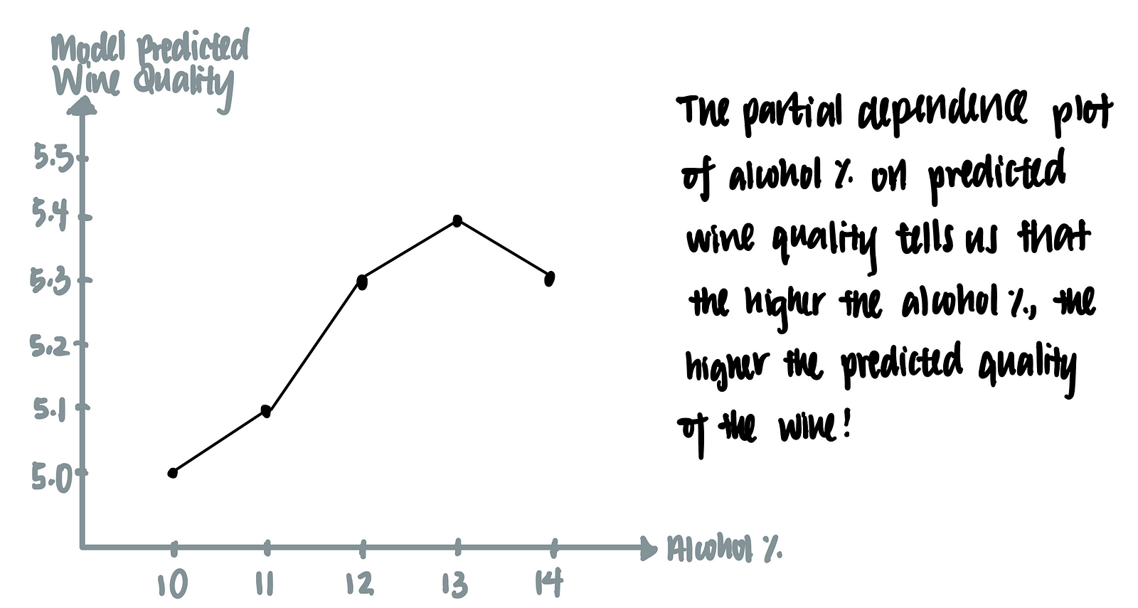
We can then plot a graph using of model-predicted wine quality against alcohol-content of the wine. This is called the partial dependence plot.
The Math behind Partial Dependence Plots
The following is a more rigorous definition of the partial dependence plot which can be skipped with no loss in continuity.
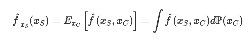
We first assume that the machine learning model is a function f that takes in all the features x and output a prediction, f(xs). We are interested in the finding the effect of one of the input feature xs on prediction, and we are not interested in the effect of all the other input features xc on prediction. In other words, we want to isolate the input feature xs. To do so, we marginalize the machine learning model over the distribution of the features xc, which is seen as P(xc). After such marginalization, we obtain the partial dependence function of the machine learning model on the particular feature xs.
In statistics, we can approximate the integral over the distribution of xc with a sum over all the values of xc by the law of large number. Here, n is the number of data in the data set, while xc is the actual values from the data set of the features that we are not interested in.
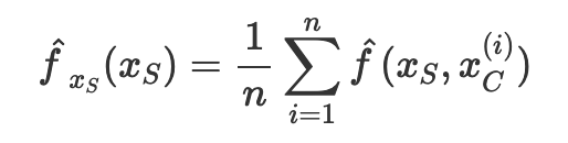
Let’s apply this formula in our data set. To obtain the partial dependence plot for the feature alcohol on the prediction outcome quality, we use the following equation.
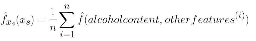
Note that there is a superscript i over other features (e.g. pH, density, sulphate) but no such superscript i over alcohol. This is because we are summing over other features to obtain the mean value of other features. The mean value of each of these features, together with the ith value of the alcohol, is fed into the machine learning model to produce a prediction, as seen in the example below.
4. Building a Machine Learning Model for Wine Quality Prediction
Data Importing
Now that we understand what is the partial dependence plot, let’s apply it to our data set. First, we download the data the UCI site.
import pandas as pddf = pd.read_csv('winequality-red.csv',delimiter=';')
Data Exploration
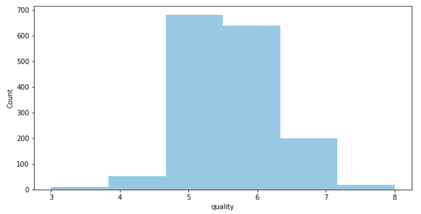
The data set does not contain any missing data, and is assumed to be clean enough to be used as-is. Thus, we can start with some data exploration:
- We see that the data set contains mostly wine of mid-tier quality (with a score of 5–6).
import seaborn as sns
import matplotlib.pyplot as pltplt.figure(figsize=(10,5))
sns.distplot(df['quality'],hist=True,kde=False,bins=6)
plt.ylabel('Count')
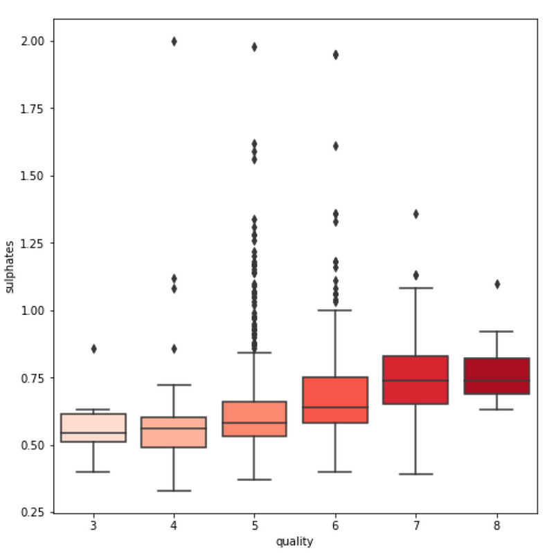
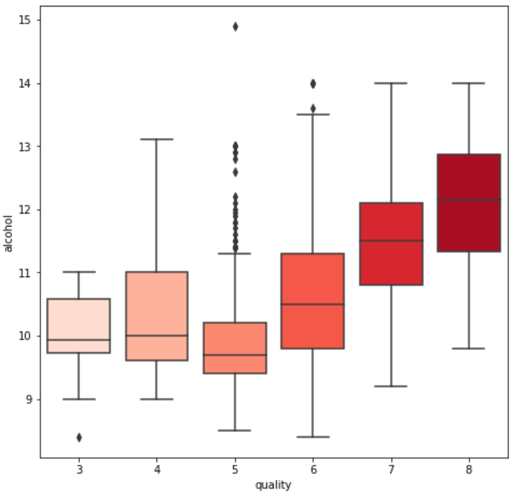
3. We see some variables like sulphates , alcohol and citric acid contents seem to be correlated to quality.
fig = plt.figure(figsize=(15, 15))
var = 'sulphates' #or alcohol, citric acid
sns.boxplot(y=var, x='quality', data=df, palette='Reds')
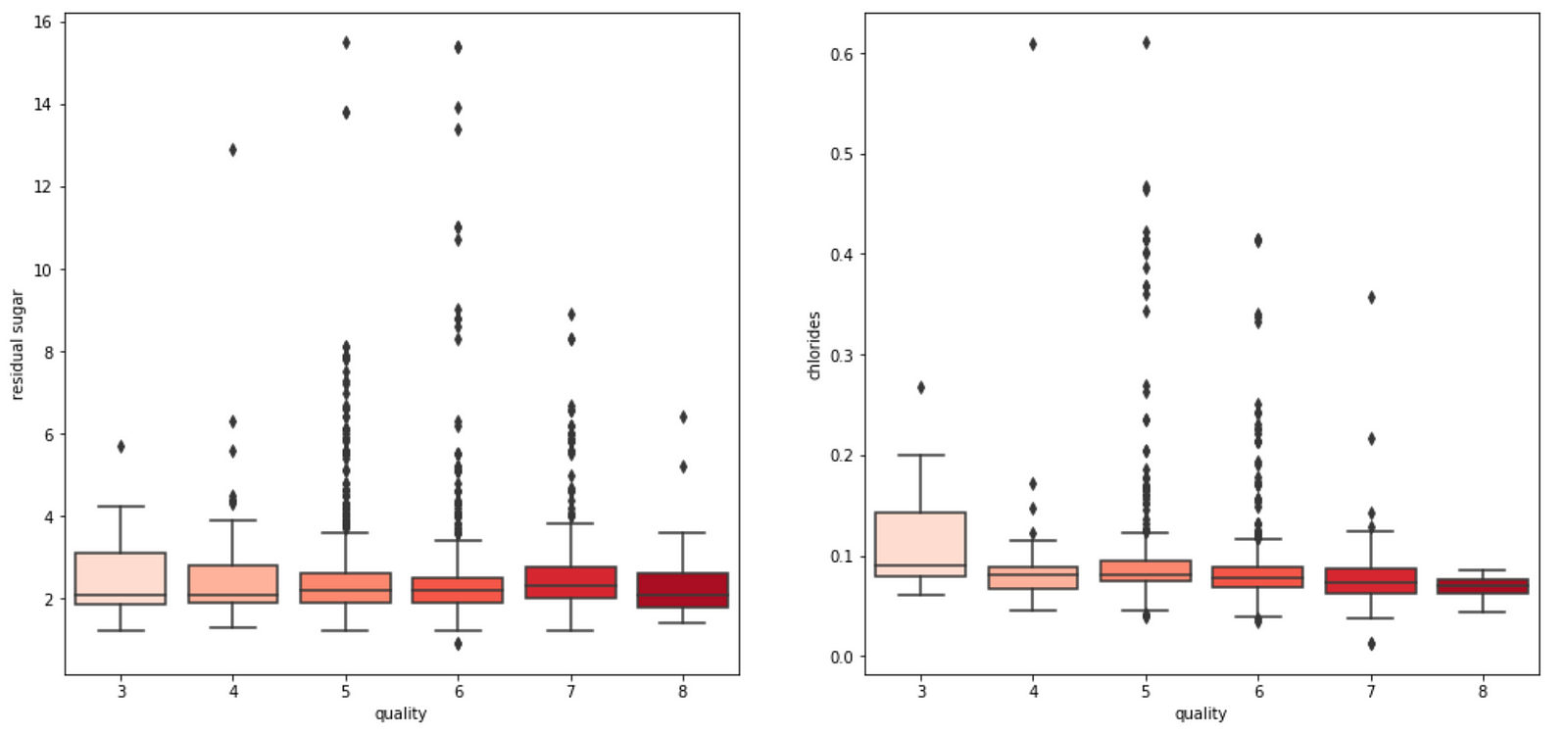
4. We also observe that some variables seem to have a weak correlation with quality, like chlorides and residual sugars content.
Model Building
Let’s quickly build a machine learning model that predicts the quality score of the wine based on all the chemical properties of the wine.
Here, we split the data into train and test data set using a train-test split ratio of 25–75.
# Using Skicit-learn to split data into training and testing sets
from sklearn.model_selection import train_test_split# Split the data into training and testing sets
features = df.drop(['quality','pH','pH_class'], axis=1)
labels = df['quality']train_features, test_features, train_labels, test_labels = train_test_split(features, labels, test_size = 0.25, random_state = 42)
We then feed the training data into a Random Forest Regressor. Here, no hyperparameter tuning is done since this is not a focus of this post.
from sklearn.ensemble import RandomForestRegressor
est = GradientBoostingRegressor()
est.fit(train_features, train_labels)
Now, let’s find out how we can do that using in python! Luckily for us, there is an elegant package — PDPBox package — that allows us to easily plot a partial dependence plot, which visualizes the impact of certain features towards model prediction for all SKlearn supervised learning algorithm. Amazing!
Let’s first install the pdpbox package.
!pip install pdpbox
Next, we plot the partial dependence plots of each variable on the quality score.
features = list(train_features.columns)for i in features:
pdp_weekofyear = pdp.pdp_isolate(model=est, dataset=train_features, model_features=features, feature=i)
fig, axes = pdp.pdp_plot(pdp_weekofyear, i)
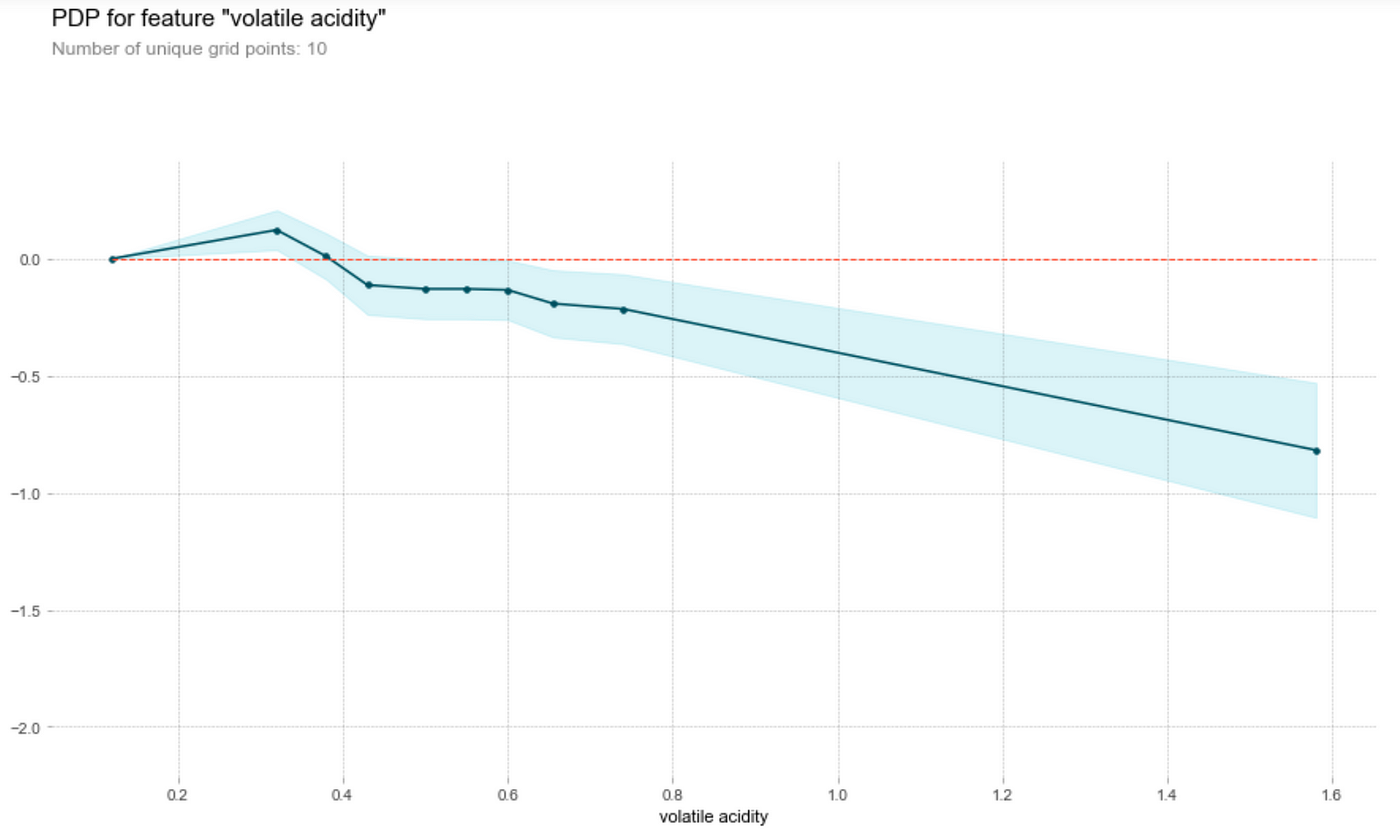
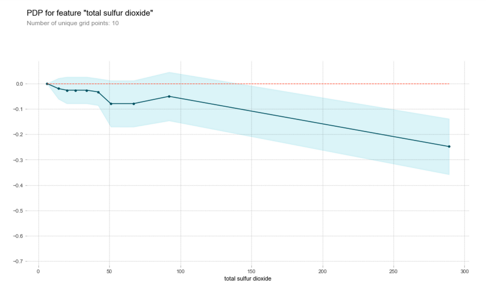
Partial Dependence Plots of Each Feature on the Wine Quality
Acidity
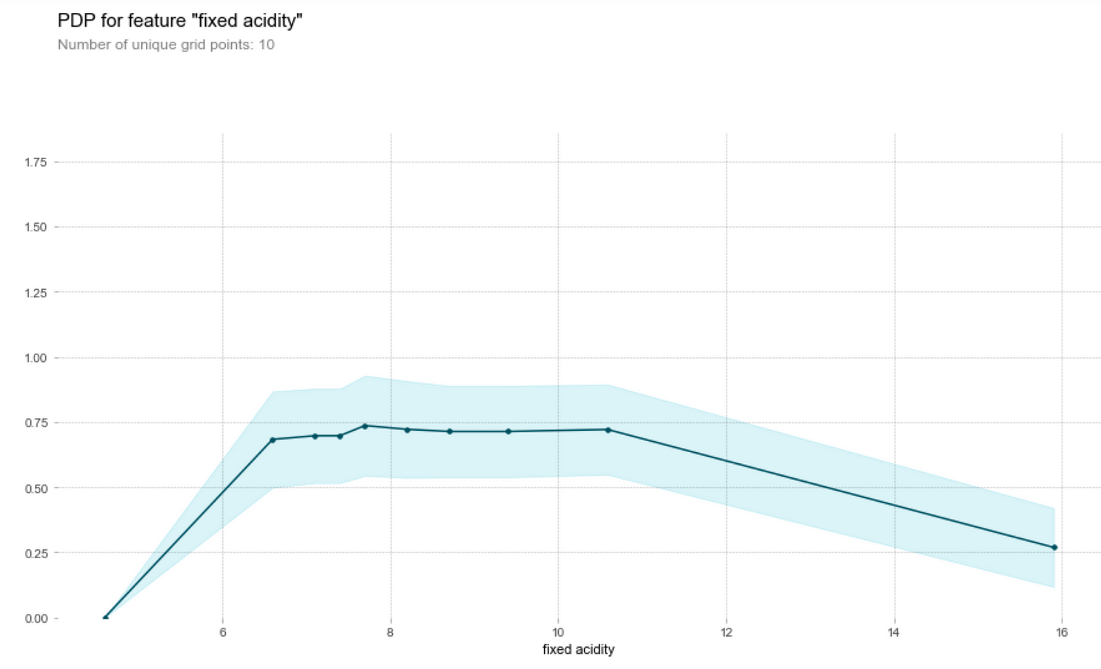
Let’s first understand how to read this graph. The vertical axis is the contribution of to the prediction of the target variable by the feature, while the horizontal axis is the range of the feature in the data set. For instance, we see that a fixed acidity (first graph above) of around 7.8 will contribute about 0.75 to the predicted wine quality score.
Wine tasters seem to enjoy wine with lower pH (higher acidity) better. In particular, they seem to love citric acid in their wines. This is not surprising, since a good wine should be acidic (i.e. not flat). However, they’re not a fan of volatile acids (volatile acids makes wine tastes like vinegar!)
Alcohol content
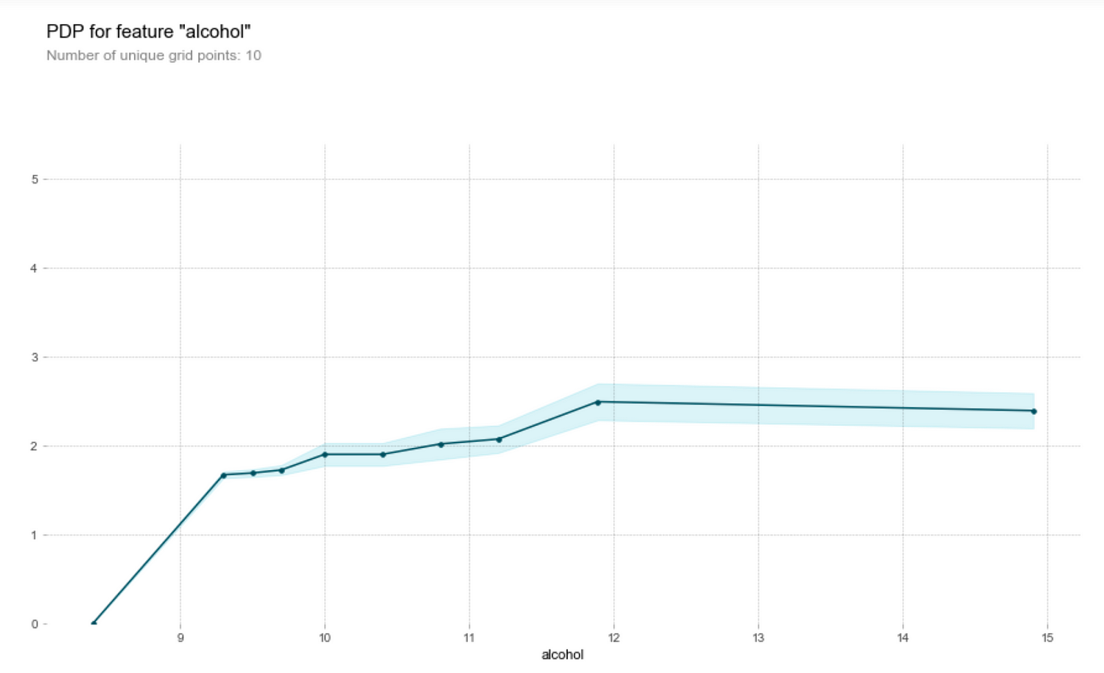
One of the main draws of wine is that it helps people relax — and that’s alcohol doing its job. Wine tasters seem to like a higher alcohol content in their wines.
Sulphate content
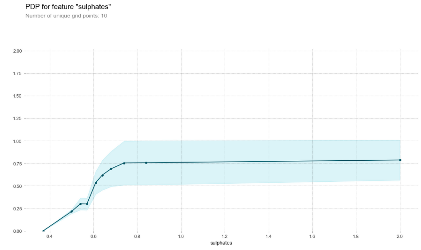
- The higher the sulphates content, the higher the model’s prediction on its quality up to a certain threshold. Why is this so? A study by Nature in 2018 indicates the sulfur dioxide reacts other chemical compounds (metabolites) in wine to create sulphite compounds, which heavily characterise the chemical profile of the oldest wines. It seems that wine tasters seem to like the higher sulphite compounds which might have made the wine tastes like older.
- On the other hand, the model thinks that wine with high sulfur dioxide content has a lower quality. This is unsurprising, since a high sulfur dioxide content generally correlates with oxidation and the presence of bacteria in wine.
Sugar and chlorides
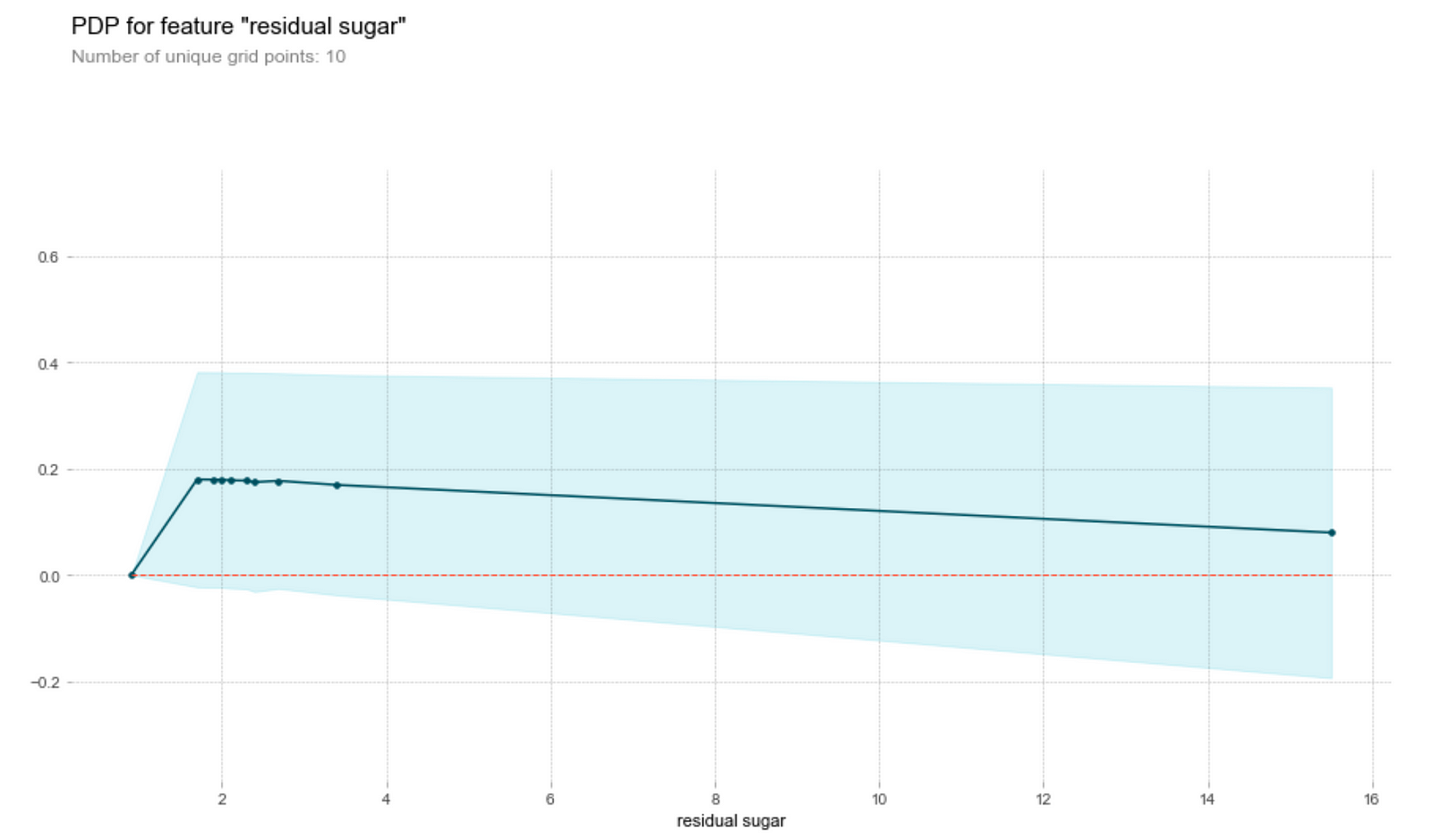
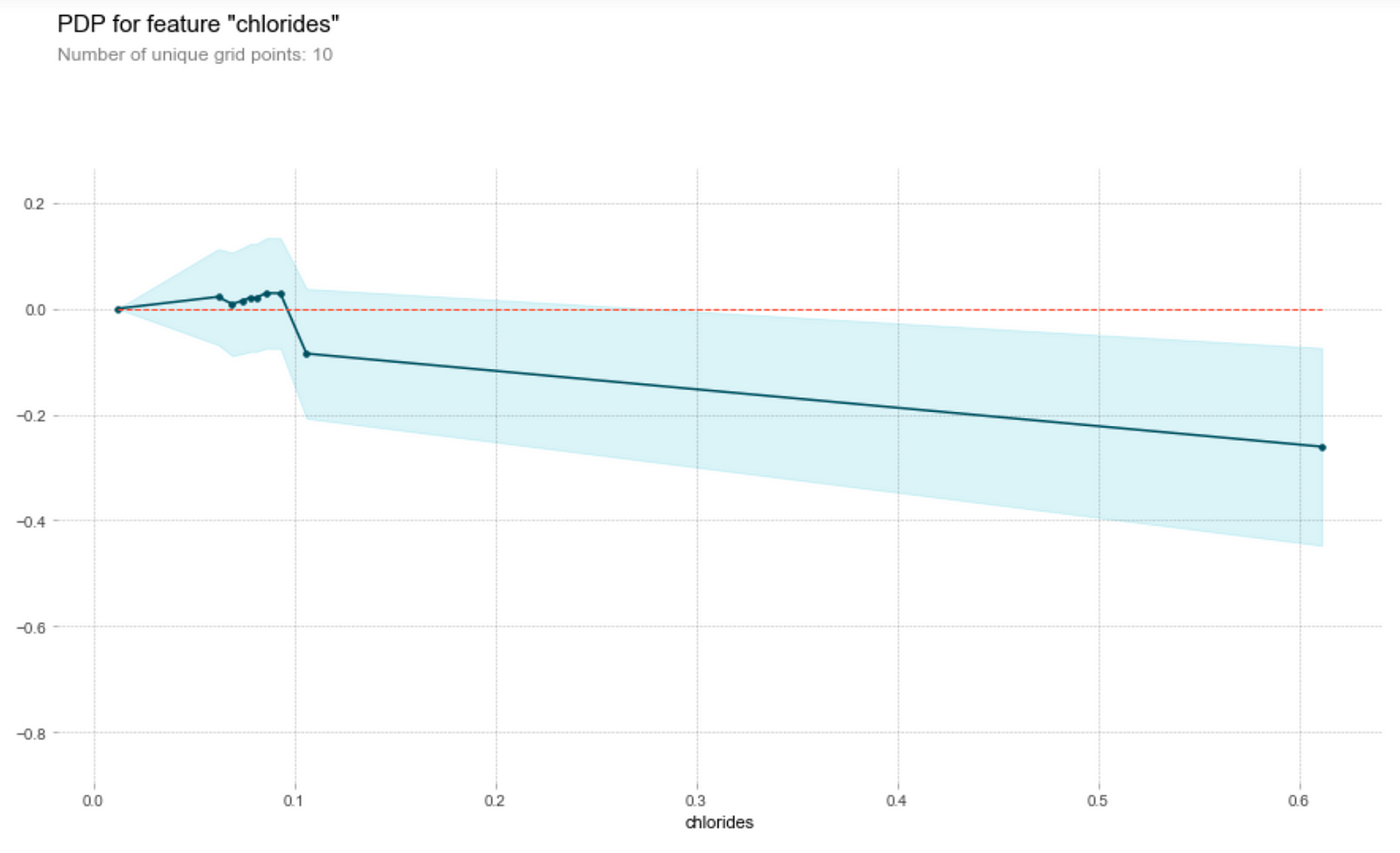
Generally, the amount of chlorides and residual sugar doesn’t seem to affect the prediction on the wine quality much. We observe that both graphs have clustered points at small magnitudes of the feature and an outlier at a higher magnitude of the feature. Ignoring the outlier, we see that a change in the feature amount does not seem to change the quality prediction much, i.e. the gradient of the points is relatively small. Thus, a change in the feature does not result in a change in the wine quality prediction.
Effect of Sulfur dioxide + pH Level on Predicted Wine Quality
I am also interested in the combined effect of sulfur dioxide and pH Level on the predicted quality.
To investigate that, let’s first split the pH level into 4 bins with equal number of data points. This step is not completely necessary, though it makes the visualization easier in the partial dependence plot.
pd.qcut(df['pH'],q=4)
>> [(2.7390000000000003, 3.21] < (3.21, 3.31] < (3.31, 3.4] < (3.4, 4.01]]# Create a categorical feature 'pH_class'
cut_labels_3 = ['low','medium','moderately high','high']
cut_bins= [2.739, 3.21, 3.31, 3.4, 4.01]
df['pH_class'] = pd.cut(df['pH'], bins=cut_bins, labels=cut_labels_3)# One-hot encode the categorical feature 'pH class' into 4 columns
pH_class = pd.get_dummies(df['pH_class'])# Join the encoded df
df = df.join(pH_class)
Then, we can plot the partial dependence plot of two variables too on the prediction as a contour plot.
inter_rf = pdp.pdp_interact(
model=est, dataset=df, model_features=features,
features=['total sulfur dioxide', ['low','medium','moderately high','high']]
)fig, axes = pdp.pdp_interact_plot(inter_rf, ['total sulfure dioxide', 'pH_level'], x_quantile=True, plot_type='contour', plot_pdp=True)
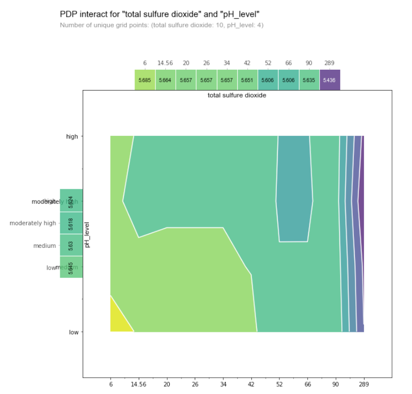
The color of the contour plot shows the predicted quality as we vary pH Level (a categorical variable) on the y-axis and the total sulfur dioxide content (a numerical variable).
The blue region indicates low predicted quality while the yellow indicates high predicted quality. This tells us that the wine lower pH and the lower sulfur dioxide content, the higher the quality of the wine (this corresponds to the bottom left corner of the chart). On the other hand, beyond a certain threshold of sulfur dioxide content (~66), we see that pH no longer has an impact on the predicted quality score, as there are only vertical lines on the contour plot on the right side of the graph.
It’s time for a drink!
Congratulations for making it so far into the post. Now that you’re a connoisseur in wine tasting, it’s time to put your knowledge to use. Get a drink and see if you can apply the knowledge you learnt from Partial Dependence Plot to good use. (Subtle hint: I’m up for a drink anytime — just hit me up on LinkedIn!)
PS/ If you’re interested in model interpretability, be sure to check out my other post on using LIME to explain black box model’s predictions on breast cancer data.
References
[1] Paulo Cortez, University of Minho, Guimarães, Portugal, http://www3.dsi.uminho.pt/pcortez A. Cerdeira, F. Almeida, T. Matos and J. Reis, Viticulture Commission of the Vinho Verde Region(CVRVV), Porto, Portugal
[2] Friedman, Jerome H. “Greedy function approximation: A gradient boosting machine.” Annals of statistics (2001): 1189–1232.
Illustrations are done by author.